For the last few year at JazzGraphs I’ve depended on the MusicBrainz database to draw data that populates many of the network graphs and other visualizations on the site. It’s an immense dataset that can be downloaded (as I’ve previously done) or accessed via the MusicBrainz API (Application Programming Interface). For upcoming visualizations, I’ve elected to go the API route, but simply as a means to access data, not to use in traditional API fashion. This approach allows for querying the topics I choose – specific artists, genres, recordings, etc. and pull down only the data needed to create a visualization.
Category: network graph
Getz, Parker, Henderson Networks Updated
I’ve added three more jazz artist networks following the same template I used for the initial group I added earlier in the week.
https://jazzgraphs.com/graphs/charlie_parker/
https://jazzgraphs.com/graphs/stan_getz
https://jazzgraphs.com/graphs/joe_henderson
Each of these network graphs show the connections between an artist, his releases, and the songs on each release. The graphs are easy to zoom, pan, and click, with an information panel opening on the left side of the screen. Enjoy!
Shorter, Coltrane, Gordon Networks deployed
After a weekend trying multiple approaches at incorporating images of jazz musicians as backgrounds to their network graphs, I finally hit on a good solution – create icon-like images that display in the upper left corner of the graph background. This allows the network to be easily viewed on multiple devices ranging from phones to widescreen monitors, without interfering with any of the network elements.
Here’s the solution, as shown for the Dexter Gordon network:


Nice and tidy, with an icon-like image created in Powerpoint; the outer circle around the image is colored to match the artist node at the center of the graph for a consistent visual appearance. Even when the sidebar is shown and the graph is zoomed in, this approach works well:


Note that the musician image is combined with the background color and the circle shape in Powerpoint, and is then saved as a picture we can use in our CSS file for the network. Here’s a look at the styling elements for this graph:
#carte {
position: absolute;
background-image: url('../img/Gordon_20230306.png');
background-repeat: no-repeat;
background-size: cover;
left: 0px;
width: 100%;
height: 100%;
}
We ensure that the background image is set to cover the entire screen by using the background-size attribute and setting it to ‘cover’. This enables the background to adjust to larger screen sizes seamlessly – no awkward edges to be seen!
From my perspective, this approach solves two issues in a very nice way:
- First, it provides a consistent look & feel to the networks, regardless of which artist we select
- Second, it is very production-friendly; I can use the same background and circle while adding in a new artist picture. This provides a very efficient solution for creating future graph networks
I’ll be adding more permanent links to all of these networks, but for now, here are the initial three:
https://jazzgraphs.com/graphs/dexter_gordon
https://jazzgraphs.com/graphs/wayne_shorter
https://jazzgraphs.com/graphs/john_coltrane
Thats’ it for now – have fun with the networks and thanks for reading!
Refining the Musician Networks, Part 1
I recently posted about the six new saxophonist networks I created using MusicBrainz data and Gephi, and have subsequently created another four, including networks for two of the acknowledged giants of the instrument – Charlie Parker and John Coltrane. However, as I was digging deeper into the data I realized that there are a lot of redundancies in the data due to a couple of grammatical issues. There are two major issues I have now addressed that will make for cleaner networks.
Here’s what these networks currently look like:

I expect to replace these with cleaner, more logical graphs after making this pair of changes. The end result will have fewer nodes and fewer edges crossing each other to connect nodes.
The first change to address is the subtle but important difference between an apostrophe character ( ‘ ) and the similar yet slightly different grave ( ` ) character. Each one is used to represent an apostrophe in the MusicBrainz release.name field, leading to duplicate entries that are actually the same song. For example, ‘Round Midnight versus `Round Midnight. Subtle difference, right? But one that my postgres queries and ultimately Gephi see as two unique songs, cluttering the network graph unnecessarily. So how do we fix this issue in the data?
I first created a new version of the releases table, just in case something went wrong as I tried to make any updates. We now have an empty table with all the same attributes as the original. Step 2 is to populate the new table with a simple SELECT INTO statement:
select * into public.release_new from public.release rThe next step is a bit trickier since it involves an apostrophe character, which postgres treats as quotation marks for other characters. We have to use some additional formatting to convince postgres that we really do want to replace all our ` characters with ‘ characters. Here’s the code I used (there are several ways to do this):
UPDATE
public.release_new
SET
"name"  = REPLACE(name,'`',E'\'')
WHERE
"name" > '0'
Without going into too much detail, we are telling our query to find all ` characters and replace them with an apostrophe. I recognize this might mess up some cases where there is an actual grave accent on a song name, but we will now have a consistent approach rather than two slightly different characters throwing us off. The goal is to ensure that we recognize a given song as a single node for our graph as much as humanly possible.
We have a second issue to correct for, but this one can be done within our query rather than updating the database. In this case, some songs are listed in upper case in one place, and then as lower case in another. We could force all text to lower case for a match, but that is less than ideal. The same holds true for upper case; we don’t want our graph labels to be all caps. A third solution is to use the INITCAP function in postgres, like this:
select b.id, b.name, b.label, b.type, SUM(b.size)as size
FROM
(SELECT DISTINCT INITCAP(a.id) as id, INITCAP(a.name) as name, INITCAP(a.label) as label, a.type, a.size
INITCAP forces all first letters to upper case while leaving the other letters as they were. It’s not a perfect solution; apostrophes cause us a problem here too, but it’s perhaps a 99% solution. By correcting the apostrophe format and then using INITCAP, we now have a much cleaner query result for Gephi. As an example, the nodes query for Joe Henderson now returns 269 records, versus the original 285, an improvement of > 5%. This should certainly help clean up our graphs, as it will also reduce the number of edges connecting the nodes.
In part 2 of this series I’ll show the impact these changes have on our network graphs. The beauty of these changes is that I can apply the logic to all future graphs. Thanks for reading, and see you soon.
Six New Saxophonist Networks
Decided to play with the latest version of Gephi by creating a new musician network, and wound up creating six using MusicBrainz data. This was a fun project and will be followed by additional work covering more great jazz musicians. Here’s a quick screenshot of one of the graphs showing the artist, album releases, and songs associated with those releases:
I’ll post the links to each network below and then take a walk through the creation process. Note that the graphs are all interactive, with panning, zooming, edge removal, and other features all available. More on those features later in the post. Here are the links to each network graph:
Note that there are at least two major omissions among saxophonists – Charlie Parker and John Coltrane, and of course some other notable names. I’ll plan to address those omissions in a future post.
To create each of these graphs I followed a simple set of steps and then used the same settings to create graphs with a consistent look & feel. The goal is to have users focus on the structure and content of the network as opposed to having to deal with changing shapes, sizes, and colors. Perhaps I’ll alter this for different instruments – piano or trumpet, for example may have a different color palette. For now, the color palette I have used conveys an appropriately jazzy aura, with the dark background and contrasting pastel-like node colors and subtle gray edges connecting the nodes.
The data for this project is sourced from the impressive MusicBrainz database. Note that MusicBrainz data covers many genres beyond jazz, but for my current purposes the focus is on jazz. I have created a local version of the data using DBeaver for writing and running SQL queries to retrieve data for ingestion by Gephi. DBeaver is a great solution for me – all of my other databases are in MySQL, while the MusicBrainz data is in PostgreSQL format. No problem, as DBeaver can handle both types (as well as many other data formats) with ease.
Here’s an example of the code used for node creation for Sonny Rollins:
SELECT a.*
FROM
((SELECT CONCAT(ac.name, ' (Artist)') AS id, ac.name AS name, ac.name AS label, 'Artist' AS type, 50 AS size
FROM public.artist_credit ac
WHERE ac.id = 21832)
UNION ALL
(SELECT CONCAT(r.name, ' (Release)') AS id, r.name AS name, r.name AS label, 'Release' AS type, COUNT(DISTINCT rl.release) AS size
FROM public.release r
INNER JOIN public.artist_credit ac
ON r.artist_credit = ac.id
INNER JOIN public.medium m
ON r.id = m.release
INNER JOIN public.medium_format mf
ON m.format = mf.id
INNER JOIN public.release_label rl
ON r.id = rl.release
INNER JOIN public.label l
ON rl.label = l.id
WHERE r.artist_credit = 21832
GROUP BY r.name
)
UNION ALL
(SELECT CONCAT(ta.name, ' (Song)') AS id, ta.name AS name, ta.name AS label, 'Song' AS type, COUNT(DISTINCT rl.release)
AS Size
FROM public.release r
INNER JOIN public.artist_credit ac
ON r.artist_credit = ac.id
INNER JOIN public.medium m
ON r.id = m.release
INNER JOIN public.medium_format mf
ON m.format = mf.id
INNER JOIN public.release_label rl
ON r.id = rl.release
INNER JOIN public.label l
ON rl.label = l.id
INNER JOIN public.track t
ON m.id = t.medium
INNER JOIN public.track_aggregate ta
ON t.name = ta.name
WHERE r.artist_credit = 21832
GROUP BY ta.name
)) a
While the code may appear complex, it’s goal is simple – retrieve all releases and songs for the artist Sonny Rollins, who has the ‘21832’ id. This code creates nodes for the artist (first section), all releases (second section) and all songs (third section). It uses the UNION ALL statement to combine the three sections into a single output file.
We then run similar code to create an edges source file:
SELECT a.*
FROM
((SELECT CONCAT(ac.name, ' (Artist)') AS source, CONCAT(r.name, ' (Release)') AS Target, 'Artist' AS source_type, 'Release' AS target_type
FROM public.artist_credit ac
INNER JOIN public.release r
ON ac.id = r.artist_credit
INNER JOIN public.release_label rl
ON r.id = rl.release
WHERE ac.id = 21832)
UNION ALL
(SELECT CONCAT(r.name, ' (Release)') AS Source, CONCAT(ta.name, ' (Song)') AS Target, 'Release' AS source_type, 'Song' AS target_type
FROM public.release r
INNER JOIN public.release_label rl
ON r.id = rl.release
INNER JOIN public.medium m
ON r.id = m.release
INNER JOIN public.track t
ON m.id = t.medium
INNER JOIN public.track_aggregate ta
ON t.name = ta.name
WHERE r.artist_credit = 21832)) a
GROUP BY a.source, a.target, a.source_type, a.target_type
This output will instruct Gephi to use the artist as a source node and all releases as target nodes (first section) and then to use all releases as source nodes with songs as target nodes. Think of this as a hierarchy of Artist –> Releases –> Songs where individual songs are associated with the release they appeared on. Of course, in jazz, many of the most popular songs will appear connected to multiple releases, ultimately making for a more interesting graph.
Now that we have created the source files, let’s shift to Gephi to see how we use them.
Gephi allows us to pull in spreadsheet files as long as they meet certain criteria. Node files should have a name, label, id, and preferably a size attribute, although this can be created within Gephi based on the data. Edge files must have source and target fields, and ideally a weight value corresponding to the strength of network connections.
Here’s our data after ingestion, starting with the nodes:
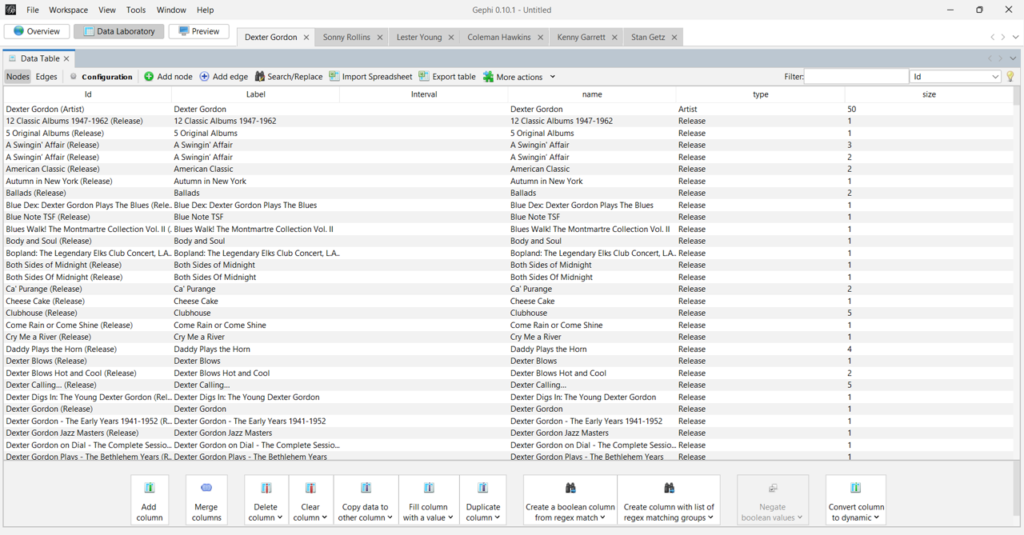
I forget to mention the usefulness of having a ‘type’ column; this will make it simple to set node colors in Gephi. Now the edges file:

You can see the source and target values, which are critical to how the graph will be displayed. Our edge weights are all set to 1 in this network, but frequently we will have varying numbers to indicate stronger versus weaker connections.
Here’s our completed graph in Gephi, after using a number of settings:
- Setting the node colors by type in the Partition tab
- Sizing the nodes in the Ranking tab
- Choosing a layout algorithm – Force Atlas 2 is a popular choice
- Scaling the graph to an appropriate size
- Preventing overlap of nodes
This process can be very iterative, playing with different settings until you are pleased with the results. For graphs like this with hundreds of nodes, different options can be tried very quickly.

The next step is to export the underlying data as a graph file – .gexf is my choice for the web template I use. Here’s a small subset of the Dexter Gordon .gexf file showing the name, type, and size associated with each node.

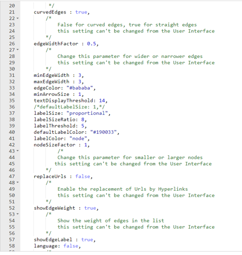
Next, we can update settings in the config.js file; These will adjust the display parameters for the nodes and edges; note that there is also a .css (Cascading Style Sheet) file where many more modifications can be made.
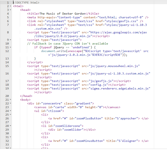
Finally, we have the index.html file that contains links to several scripts as well as the config file. This is where we can also add a title and small bits of information about the graph content.
I’ll be creating additional network graphs using this same end to end approach. The process becomes easier once the code has been tested and validated, and the settings have been standardized in Gephi and the resulting output files; much of the effort will simply involve copying and pasting existing settings. Watch this space for new graphs, and thanks for reading!
We’re Back!
After a 4-year(!) absence, I’m trying to get back in the groove with the Jazzgraphs site. The first step is to update the data tables behind the scenes, using data from the MusicBrainz project, a sort of Wikipedia for music information. The potential is enormous, but involves some effort on my end to get things rolling again.
MusicBrainz provides an amazing array of data covering artists, recordings, labels, etc. that can be leveraged for some fun visualizations. For now, I’m in the midst of the data wrangling stage, updating each table with the freshest data available so I can stay up to date. BTW, the data extends well beyond jazz, so get ready for some visualizations that extend the boundaries a bit.
The plan is to get the data refreshed over the next week, and then to start building some interesting networks covering pivotal artists; in the past I did some work presenting networks for Charles Mingus, Miles Davis, and the ECM label.
Mingus:
Miles:

ECM:

Stay tuned for some fresh new work in the coming weeks and months!
The Music of Charles Mingus
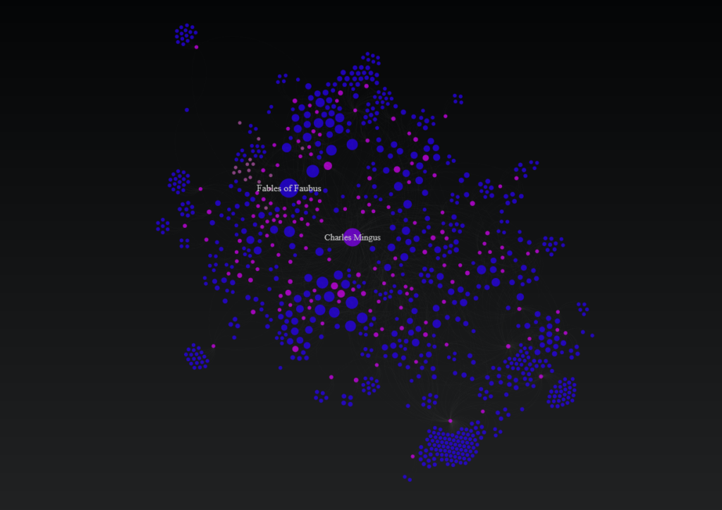
In honor of the recently released Mingus live recording from 1973, Jazz in Detroit/Strata Concert Gallery/46 Selden, I have created a Mingus network graph detailing his many recordings and songs, using data from the MusicBrainz database. This new recording is not part of the network, but many other classic Mingus works are detailed.
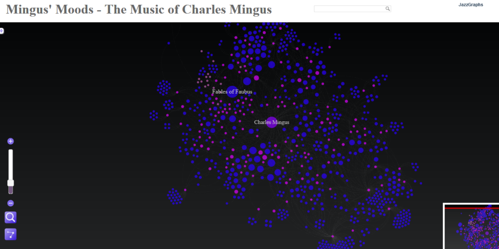
This graph shows Mingus at the center, surrounded by his many recordings, with individual songs connected to the recordings where they appear. Songs are sized based on the number of recordings they appeared on, providing a quick glimpse into Mingus’ most notable tunes. Use the zoom and pan controls as well as the search box to navigate the graph. The data is sourced from the MusicBrainz database, while the graph is built using Gephi and sigma.js.
Here’s a link to the live version – enjoy!
ECM Label Network
One of the great strengths of the MusicBrainz database is that we can build networks using not only artists, but also record labels, or even individual songs. In this post, we’re going to explore an example (per a reader suggestion) using the ECM label and its variants. ECM is known for producing high quality recordings from an array of both jazz and classical artists. Keith Jarrett, Charles Lloyd, and Gary Burton are among some of the better known artists with multiple ECM recordings.
In contrast to our Miles Davis network, where the focus was on the artist, we now wish to see the labels (ECM) as hubs within the network. We’ll take a similar approach to constructing the node and edges files, although we now are going to create a multi-modal structure with 4 layers: Label –> Artist –> Release –> Songs. Using PostgreSQL, we can pull this data quite easily from the MusicBrainz database. Let’s start with the nodes logic:
SELECT a.*
FROM
((SELECT CONCAT(l.name, ‘ (Label)’) AS id, l.name AS name, l.name AS label, ‘Label’ AS type, 30 AS size
FROM label l
WHERE l.id IN(46800,1884,106711,123517))
UNION ALL
(SELECT CONCAT(ac.name, ‘ (Artist)’) AS id, ac.name AS name, ac.name AS label, ‘Artist’ AS type, 10 AS size
FROM public.release r
INNER JOIN public.artist_credit ac
ON r.artist_credit = ac.id
INNER JOIN public.medium m
ON r.id = m.release
INNER JOIN public.medium_format mf
ON m.format = mf.id
INNER JOIN public.release_label rl
ON r.id = rl.release
INNER JOIN public.label l
ON rl.label = l.id
WHERE l.id IN(46800,1884,106711,123517))
UNION ALL
(SELECT CONCAT(r.name, ‘ (Release)’) AS id, r.name AS name, r.name AS label, ‘Release’ AS type, COUNT(DISTINCT rl.release) AS size
FROM public.release r
INNER JOIN public.release_label rl
ON r.id = rl.release
INNER JOIN public.label l
ON rl.label = l.id
WHERE l.id IN(46800,1884,106711,123517)
GROUP BY r.name
)
UNION ALL
(SELECT CONCAT(ta.name, ‘ (Song)’) AS id, ta.name AS name, ta.name AS label, ‘Song’ AS type, COUNT(DISTINCT rl.release)
AS Size
FROM public.release r
INNER JOIN public.artist_credit ac
ON r.artist_credit = ac.id
INNER JOIN public.medium m
ON r.id = m.release
INNER JOIN public.medium_format mf
ON m.format = mf.id
INNER JOIN public.release_label rl
ON r.id = rl.release
INNER JOIN public.label l
ON rl.label = l.id
INNER JOIN public.track t
ON m.id = t.medium
INNER JOIN public.track_aggregate ta
ON t.name = ta.name
WHERE l.id IN(46800,1884,106711,123517)
GROUP BY ta.name
)) a
The four sections of code are united by one common attribute – the four record label identifiers associated with ECM. Section 1 creates nodes for the record labels, section 2 the recording artists, section 3 the releases, and section 4 the songs on each release. This should give us a very interesting network, although it will not have the same level of cross-pollination as the earlier Miles Davis network, as the songs are being associated with specific releases.
Creating the edges is quite similar, albeit requiring just three sections of code:
SELECT a.*
FROM
((SELECT CONCAT(l.name, ‘ (Label)’) AS source, CONCAT(ac.name, ‘ (Artist)’) AS Target, ‘Label’ AS source_type, ‘Artist’ AS target_type
FROM public.label l
INNER JOIN public.release_label rl
ON l.id = rl.label
INNER JOIN public.release r
ON rl.release = r.id
INNER JOIN public.artist_credit ac
ON r.artist_credit = ac.id
WHERE l.id IN(46800,1884,106711,123517))
UNION ALL
(SELECT CONCAT(ac.name, ‘ (Artist)’) AS Source, CONCAT(r.name, ‘ (Release)’) AS Target, ‘Artist’ AS source_type, ‘Release’ AS target_type
FROM public.release r
INNER JOIN public.release_label rl
ON r.id = rl.release
INNER JOIN public.artist_credit ac
ON r.artist_credit = ac.id
INNER JOIN public.label l
ON l.id = rl.label
WHERE l.id IN(46800,1884,106711,123517))
UNION ALL
(SELECT CONCAT(r.name, ‘ (Release)’) AS Source, CONCAT(ta.name, ‘ (Song)’) AS Target, ‘Release’ AS source_type, ‘Song’ AS target_type
FROM public.release r
INNER JOIN public.release_label rl
ON r.id = rl.release
INNER JOIN public.artist_credit ac
ON r.artist_credit = ac.id
INNER JOIN public.label l
ON l.id = rl.label
INNER JOIN public.medium m
ON r.id = m.release
INNER JOIN public.track t
ON m.id = t.medium
INNER JOIN public.track_aggregate ta
ON t.name = ta.name
WHERE l.id IN(46800,1884,106711,123517))
) a
GROUP BY a.source, a.target, a.source_type, a.target_type
Here we are simply connecting labels to artists, artists to releases, and releases to songs. Both the node and edge results are saved to .csv files for use in Gephi.
Once the data was in Gephi, I spent parts of a few days testing layouts, spacing, colors, sizing, and so on, before settling for the moment on using the popular Force Atlas 2 algorithm. I find it useful to start the process using the rapid (and less precise) OpenOrd algorithm whenever working with a fairly complex or large dataset. Then, once the basic network structure is revealed, we can move on to Yifan Hu, Force Atlas, or any of the more precise methods.
For the (for now) final version, I elected to size the nodes based on the number of outbound degrees, which will place more visual emphasis on the record labels and releases, respectively. Artists with multiple releases will also be represented by slightly larger nodes. So here are two versions, the first in Gephi:
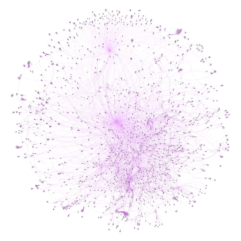
The second version is from the web, after tweaking settings in sigma.js:
To interact with the network, click here. Thanks for reading!
Visualizing Miles, Part 2
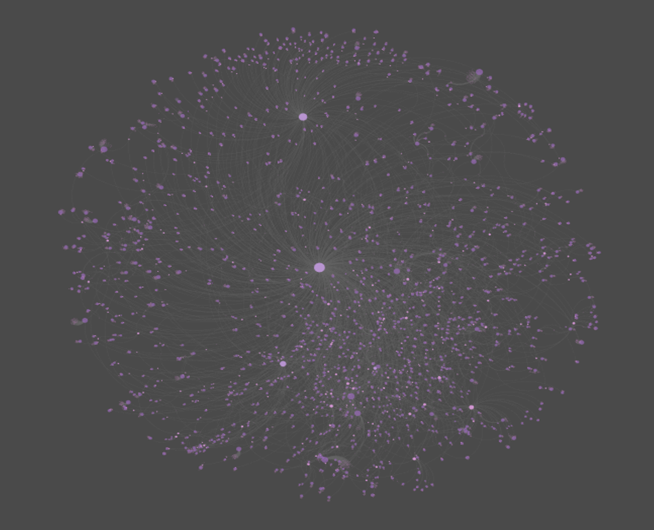
One of my favorite aspects of working with web projects is the ability to use CSS to customize a page. This is especially the case when working with sigma.js for the deployment of network graphs. CSS makes it easy to quickly test and change colors, modify elements, and experiment with different fonts. This is all important when I’m seeking a particular look and feel for a visualization. Which leads into this updated take on my recently created Miles Davis network graph, wherein the node colors, edge widths, and font sizes have all been modified, for the better, I believe.
In place of the nearly black background is a deep, rich blue, as well as new node colors and a more readable font color for the sidebar. Here are the before and after views:
And the updated look:
Visualizing Miles
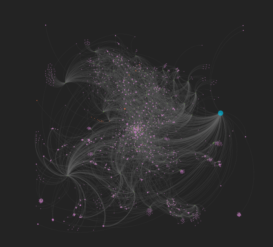
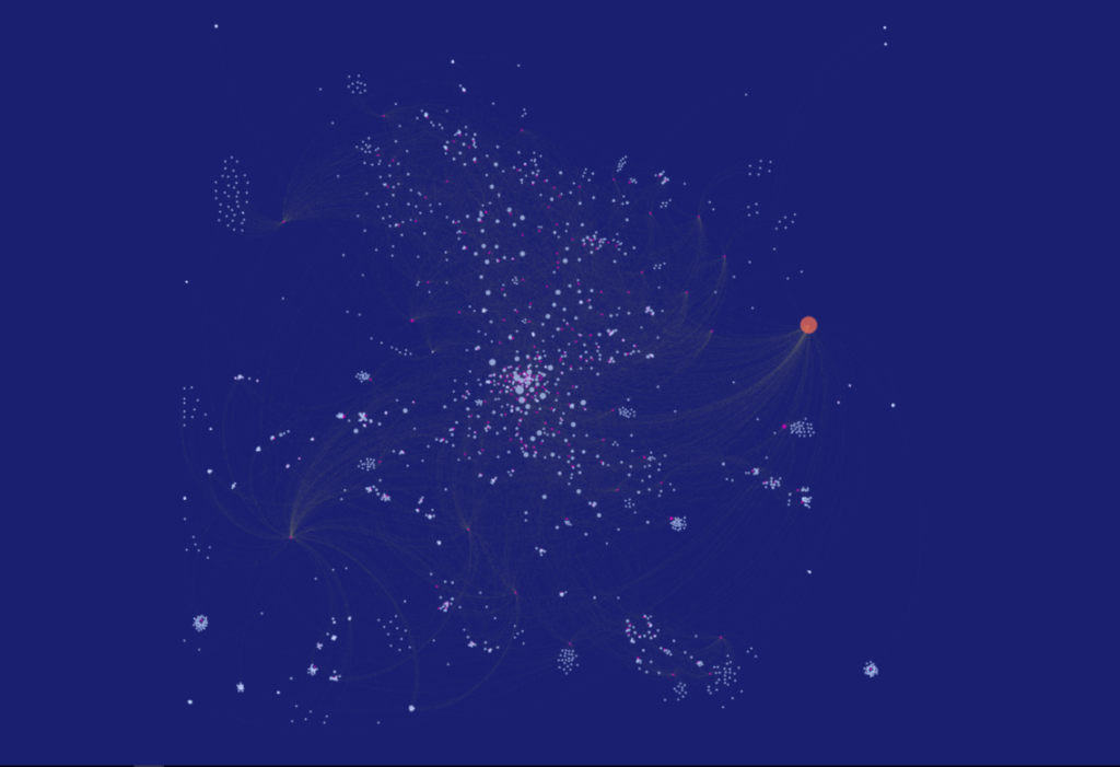
I’ve been spending some time working with data from the MusicBrainz site, and exploring various ways to create networks using Gephi. My initial explorations focus on the vast musical network of Miles Davis, as seen through album releases and the many songs Miles recorded. Here’s a look at one such iteration, wherein Miles is connected to releases, which are in turn connected to songs. Of course, many of the songs are associated with multiple releases, making for an interesting graph displaying all the connections between artist, releases, and songs.
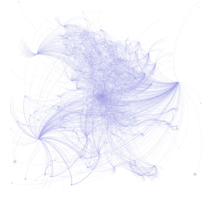
Miles can be found to the far right of this graph, with dozens of connections flowing outbound to his many releases. In the web-based version below (built using sigma.js), we can see a bit more detail and structure in the network:
Now Miles can be seen clearly, as we have enlarged his node to draw attention to him as the focal point of the network. We can also begin to see some of the most frequently released songs as larger pink circles. Tunes like ‘So What’ and ‘Milestones’ appear on many releases, and are sized accordingly. Of course, one of the best aspects of deploying the network to the web is the ability to offer interactivity, where users can zoom, pan, click, and otherwise navigate the network to learn more. If you wish to do so, click here to open the network in a new tab.
Note that this is an unfinished product at this point, despite being several iterations in the making. I have yet to resolve spelling differences that make one song appear to be many different tunes (‘Round Midnight is a classic example), and I also plan to make some other modifications. Having said that, it feels like we’re close to a working template that will allow for depicting the networks of so many of the heroes of jazz – Coltrane, Monk, Ellington, Parker, Mingus, and many more.
So stay tuned for periodic updates and improvements, and thanks for reading!
