Month: December 2022

Miles Davis Sunburst Visualization

With the Christmas holiday chaos (somewhat literally this year) in the rearview, I’ve been playing a bit with the MusicBrainz data and the Flourish visualization library. First up was using some repurposed code to visualize Miles Davis recordings. I thought a sunburst diagram might be an interesting way to show album releases and the songs on each release. Turns out it wasn’t quite as simple as I thought…it never is!

After multiple query tweaks and iterations, I’ve got something fun and interesting. Miles produced so much music, with much of it re-released in multiple formats (think vinyl vs. cd) and in various collections, factors that wound up influencing my query and chart logic. As is the case for many jazz artists, multiple labels are an issue, so why not create a filter to view releases for each label (Columbia, Blue Note, etc.)? And many songs turn up on multiple releases (studio, live, collections), so we need to account for that as well.

So my thought with using a sunburst was to group songs and releases together, and allow filtering by label. Mind you, it took multiple attempts to get the data in the best format, but we eventually wound up with something workable to feed the sunburst chart.

If you aren’t familiar with the sunburst chart, here’s a quick primer. The goal of a sunburst chart is to display hierarchical information in a circular layout with 2 or 3 levels (typically). The outer layer has more surface area to work with, and successive inner layers each have less visual space to use. For this reason, I wound up using individual songs in the outermost layer, with their respective albums as the inner layer. With an average of perhaps 5-10 songs per album, this takes advantage of the sunburst hierarchy framework.

Here’s what the code eventually became, after multiple iterations:

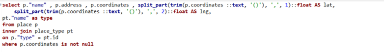
SELECT distinct ac.name AS artist, l.label_code, l.name AS label_name, r.name AS release, mf.name AS format, t.name AS id, t.name AS label, t.name AS name,
r.name AS recording,
CASE WHEN t.length < 180000 THEN ‘< 3 Minutes’ WHEN t.length < 300000 THEN ‘3-5 Minutes’ WHEN t.length < 420000 THEN ‘5-7 Minutes’ WHEN t.length < 600000 THEN ‘7-10 Minutes’ WHEN t.length > 600000 THEN ’10+ Minutes’
ELSE ‘No Length’ END category

FROM public.release r
INNER JOIN public.artist_credit ac
ON r.artist_credit = ac.id
INNER JOIN public.medium m
ON r.id = m.release
INNER JOIN public.medium_format mf
ON m.format = mf.id
INNER JOIN public.release_label rl
ON r.id = rl.release
INNER JOIN public.label l
ON rl.label = l.id
INNER JOIN public.track t
ON m.id = t.medium
INNER JOIN public.recording re
ON t.recording = re.id

WHERE r.artist_credit = 1954
and mf.name = ’12” Vinyl’

ORDER BY l.name, r.name

What we’re doing here, in a nutshell, is retrieving all the information for Miles Davis’ 12″ vinyl releases; many of these recordings were eventually released on CD, so we’re attempting to avoid duplication here. The ‘r.artist_credit = 1954’ line refers to Miles Davis and his MusicBrainz artist ID, while the medium_format name field is set to grab just 12″ vinyl releases.

Enough of the technical details – let’s view some results:

Here’s a look at the dropdown filter we created using labels:

Miles Davis sunburst labels filter

Note that we ordered our query by both label name and release name; this translates to an alpha sorted dropdown on labels, making it much more intuitive to select a specific label. We can choose to display all labels, but that gets rather messy for an artist like Miles who recorded for or was re-released by many companies. Let’s filter it down to Columbia, a major label who Miles recorded for many times:

Miles Davis Columbia releases

The inner circle displays individual releases, of which there are many, while the outer ring displays the songs on each release. The Flourish sunburst charts are interactive, but it’s a challenge to see what’s going on in our static image. Let’s move to the Blue Note label, a major force in jazz, but one where Miles was not a major player:

Miles Davis Blue Note releases

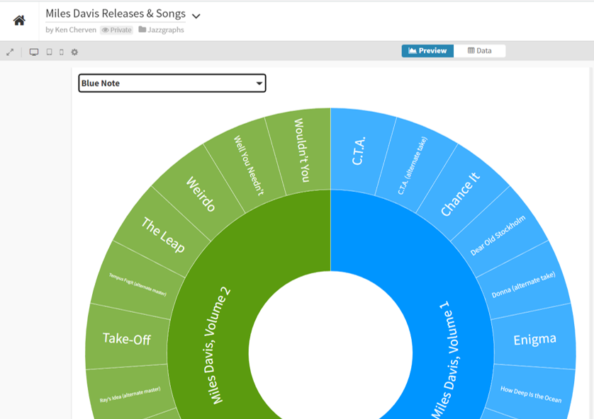
Now we can see the layout, with album releases surrounded by individual songs. We can go a step further by clicking on the Miles Davis, Volume 1 layer, which reveals the following:

Miles Davis Blue Note drilldown

Now we are focused strictly on that release and can easily view the songs on that album. Hope you get the general idea for how the sunburst charts work. Now have a go at it yourself with the live version:

I’ll have more of these to come, as it feels like a great way to capture a lot of information in a fun, interactive layout. See you soon, and thanks for reading!

Mapping Venues with Flourish

I recently shared some venue maps created in Carto using MusicBrainz data where we can see all the musical venues (with lat/lng coordinates) listed in the database. Now that I am exploring Flourish as a visualization tool, it is time to test the mapping capabilities to see if it provides a viable alternative for geographic visualization.

As with the Carto map, the first step is to retrieve the data with a query from my local MusicBrainz database:

select p.”name” , p.address , p.coordinates , split_part(trim(p.coordinates ::text, ‘()’), ‘,’, 1)::float AS lat,
split_part(trim(p.coordinates ::text, ‘()’), ‘,’, 2)::float AS lng,
pt.”name” as type, ar.name as locale
from place p
inner join place_type pt
on p.”type” = pt.id
inner join area ar
on p.id = ar.id

where p.coordinates is not null

The results are exported to a .csv file for ingestion by the Flourish map template. In this case we are using a point map to display venues using the latitude (lat) and longitude (lng) data we just created. Before uploading our data, we can see that Flourish provides an easy to use template populated with sample data, allowing us to see the data format we need to deliver:

Sample data for a Flourish point map

Here we can see a name field (City) and latitude and longitude fields for positioning points on a map. Other attributes provide data that might be used for sizing, coloring, or context.

In our case, we can upload our venues .csv file in this general format, and then tell Flourish which columns to use. Here’s what our data looks like after uploading:

Data for venue mapping

Now that the data has been uploaded we can specify which columns to use. Rather than using column names (Name, Address, etc.), Flourish works off the actual column locations (A, B, C, etc.). These are the values we need to input in the options tab. We can use A, B, and F for describing the data with labels and/or popups, use D for latitude and E for longitude, and switch from the Date to the Preview pane.

When we complete that task, Flourish gives us an attractive map, with many templates to choose from, and dozens of options for styling the map and surrounding area:

Venues map zoomed in to Italy

Here’s a quick view of the many available categories for styling your map:

Template options for mapping with Flourish

We’ll skip the details for now, but it is obvious that we could do an amazing number of things to customize our map.

To answer my earlier question, it appears that Flourish will be more than capable for mapping a variety of data, and I’m looking forward to testing it with much larger data sets. See you soon, and thanks for reading!

Music Venues – Interactive Maps

As a follow-up to my last post on mapping music venues using the great MusicBrainz database, I am adding interactive versions of the maps for you to explore. First up is the cluster map showing aggregations of venues across the globe. Scroll in and out to view more or less detail:

The second map view uses a categorical approach, coloring each venue by it’s specific type (arena, stadium, etc.) and provides additional information when a venue is selected. As you scroll in the specific venues become more visible:

Have fun exploring, and watch for new maps coming soon!

Music Venues Mapped

The last two weeks have been quite involved with updating my local database with data from the amazing MusicBrainz site. If you’re not familiar with MusicBrainz, it is a bit of a wiki for musical data, including artists, releases, places, and so much more. It’s a truly impressive data source, and it is, of course, very large from a data perspective.

While this site is skewed toward jazz, it would be a shame not to dabble in some other genres; after all, I have spent my share of time listening to classical, rock, Americana, and a few more styles of music. I’ll begin with a simple mapping of all the places (not just jazz venues) in MusicBrainz with lat/lng coordinates, using my old friend Carto to do the display work.

Let’s start by viewing a set of the raw data from the place table using DBeaver:

Data sample of MusicBrainz places

Here you get an idea of useful information we can pull from the place table; name, address, coordinates, and type, plus new fields created in the query for latitude and longitude. Carto (plus Mapbox and other mapping platforms) requires latitude and longitude attributes in order to map the data. Here’s the simple code used to extract this information:

Code to create lat/lng attributes

After creating a .csv export file, the data is uploaded to Carto, where we can begin mapping the information in a variety of ways. Since the places dataset is quite large (21k records with coordinates), a cluster map might prove useful. Carto allows for setting some options, including bubble and text sizes to optimize the display. Cluster maps aggregate the information at high levels, and then allow us to scroll in on the information at a more localized level. Here is the Carto menu:

Setting cluster options in Carto

Here’s a very high level display using the cluster option:

Top level of the place cluster map

As we scroll in, the bubbles will change into smaller aggregations:

Scrolling in on the place cluster map

At the deepest level of scrolling, every place in the data file will display as a single point at it’s respective lat/lng coordinates:

Lowest level of the place cluster map

This is fun to see how the data is aggregated and ultimately dispersed at lower and lower levels, but it comes with some limitations, including the inability to see any identifying details at the individual place level. To see this information, we’ll need a different Carto visualization.

Let’s investigate the category option, which allows for the addition of labels and the coloring of attributes by a specific category. We select the categorywizard, and choose the type column to be used for coloring markers on the map.

Setting Carto category map options

Here’s what we see at a very high level – lots of individual markers (and colors) that are not consolidated as they were with the cluster approach.

High level view of the place category map with type colors

The positive trade-off comes when we select any individual marker, where we have set up the info window to display the name, type, and address:

An individual place with detailed information

This was a simple overview for how we can visualize the place data; in future posts I look forward to exploring some more interesting uses of this rich geographic data. Thanks for reading!