Tag: DBeaver

Musical Genres via MusicBrainz Data

Once again I have pulled the core MusicBrainz tables into my local version of PostgreSQL, where I can start exploring all sorts of musical data – recordings, releases, places, artists, and much, much more. The database is large, totaling nearly 17 gigabytes of data across 171 tables, so there is no shortage of potential topics to explore.

One of the areas that intrigues me the most is an exploration of musical genres, created in MusicBrainz for contributors to categorize recordings. While the genres don’t currently tie in to individual recordings or releases in the database, I hope to use them with my own collection of music to create some potentially interesting visualizations. For now, let’s undertake an exploration of the raw data on genres, using the DBeaver database tool.

Our first table is simply named genre; let’s look at a screenshot of some of the data:

Data from the MusicBrainz genre table

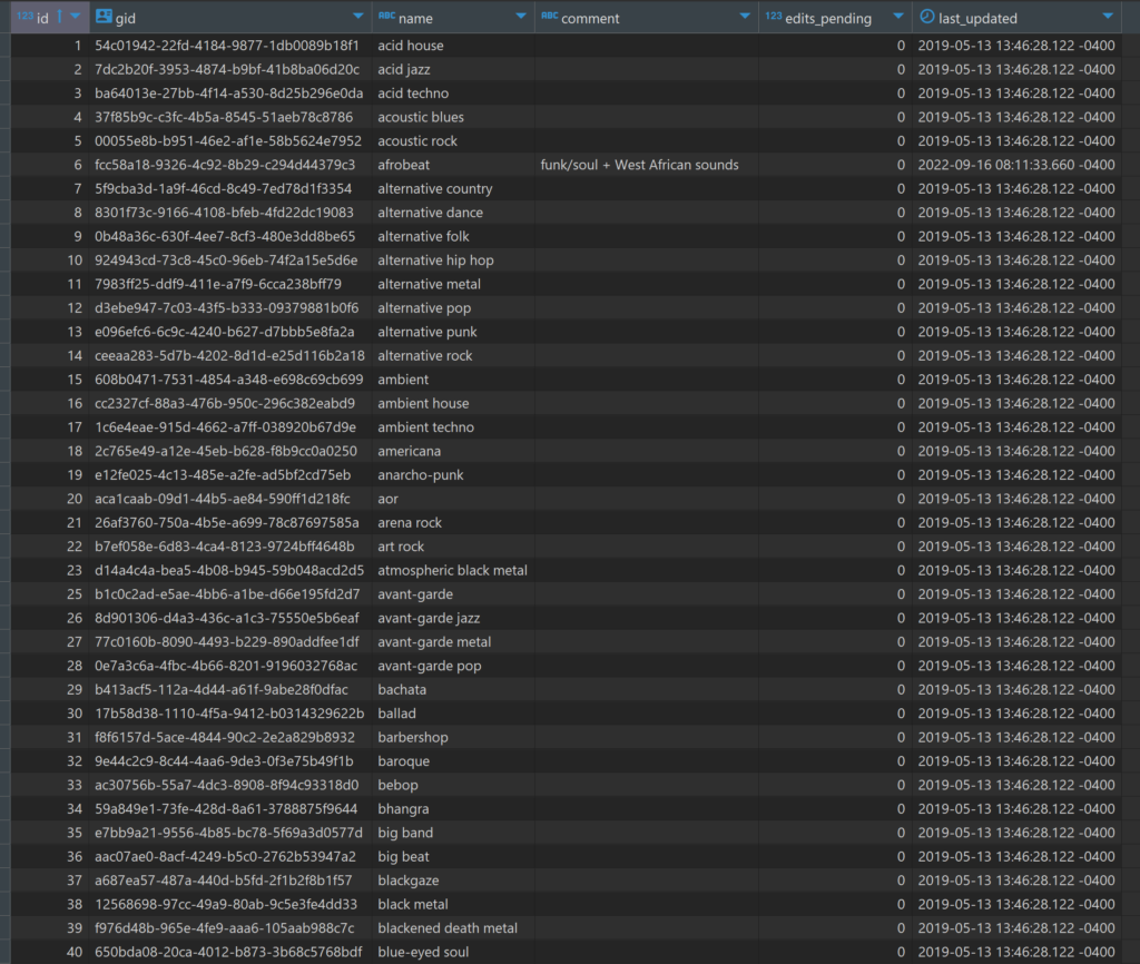
Each genre has a unique id and gid value linked to a distinct genre name such as acid house, arena rock, or bebop. As you can tell, we’re going to a very specific level here, not simple classifications like pop, rock, or jazz. This should make it quite interesting (but not so easy!) when I start tagging my own music collection.

A second table is named genre_alias; here we find some examples where distinct names are rolled up to a single genre id to join to the genre table we just saw. For instance, have a look at some of the entries below:

Data from the MusicBrainz genre_alias table

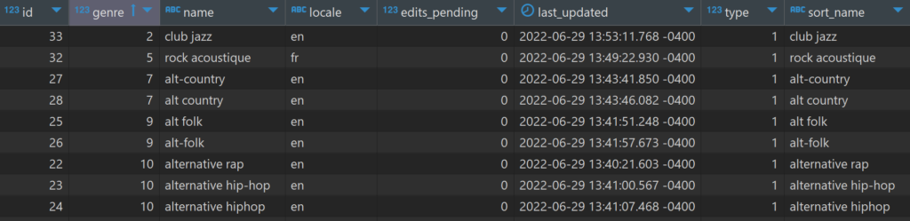
We see multiple rows pointing to a single genre id (the genre column), largely based on alternative spellings or differing punctuation. The last three rows display one such case – alternative rap, alternative hip-hop, and alternative hiphop all have a genre value of 10; in the genre table this classifies all three as alternative hip hop. In other words, these entries are three possible variations on the original alternative hip hop genre; they all represent the same musical genre. In a sense, this is some data cleansing that I won’t need to perform.

A third table is named l_genre_genre; it ties together sub-genres with a higher level ‘umbrella’ genre. Using the alternative hip hop example from above, let’s dive into this table, where we can see the 10 value in the entity1field:

Alternative hip hop id in the entity1 column

Note the 199 value in the entity0 column; if we refer back to the genre table, here’s what we see:

Top level hip hop id in the genre table

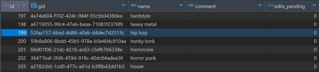
The 199 id value corresponds to hip hop, which contains the alternative hip hop genre, as well as any other sub-genres related to hip hop. So entity0represents the higher level grouping, with entity1 representing the next level down (a sub-genre). In terms of classifying music, we can now use two levels, which may prove useful when it comes to building visualizations.

Is there anything we can visualize at this early stage? How about a very simple sunburst chart? These will become far more interesting when I can tag my own collection with genre info, but for now, here’s a conceptual look using Flourish. You can use the filter or click on a genre to focus the display.

I hope you can see the potential here; ultimately each genre and sub-genre will be sized based on the number of albums (vinyl & CD) in a collection. This will provide a quick visual indication for where someone’s musical preferences lie. There may even be the possibility to take it down to the single recording level, but we’ll have to test that idea.

That’s it for now; looking forward to doing some more fun stuff with the MusicBrainz data. Thanks for reading!

Music Venues Mapped

The last two weeks have been quite involved with updating my local database with data from the amazing MusicBrainz site. If you’re not familiar with MusicBrainz, it is a bit of a wiki for musical data, including artists, releases, places, and so much more. It’s a truly impressive data source, and it is, of course, very large from a data perspective.

While this site is skewed toward jazz, it would be a shame not to dabble in some other genres; after all, I have spent my share of time listening to classical, rock, Americana, and a few more styles of music. I’ll begin with a simple mapping of all the places (not just jazz venues) in MusicBrainz with lat/lng coordinates, using my old friend Carto to do the display work.

Let’s start by viewing a set of the raw data from the place table using DBeaver:

Data sample of MusicBrainz places

Here you get an idea of useful information we can pull from the place table; name, address, coordinates, and type, plus new fields created in the query for latitude and longitude. Carto (plus Mapbox and other mapping platforms) requires latitude and longitude attributes in order to map the data. Here’s the simple code used to extract this information:

Code to create lat/lng attributes

After creating a .csv export file, the data is uploaded to Carto, where we can begin mapping the information in a variety of ways. Since the places dataset is quite large (21k records with coordinates), a cluster map might prove useful. Carto allows for setting some options, including bubble and text sizes to optimize the display. Cluster maps aggregate the information at high levels, and then allow us to scroll in on the information at a more localized level. Here is the Carto menu:

Setting cluster options in Carto

Here’s a very high level display using the cluster option:

Top level of the place cluster map

As we scroll in, the bubbles will change into smaller aggregations:

Scrolling in on the place cluster map

At the deepest level of scrolling, every place in the data file will display as a single point at it’s respective lat/lng coordinates:

Lowest level of the place cluster map

This is fun to see how the data is aggregated and ultimately dispersed at lower and lower levels, but it comes with some limitations, including the inability to see any identifying details at the individual place level. To see this information, we’ll need a different Carto visualization.

Let’s investigate the category option, which allows for the addition of labels and the coloring of attributes by a specific category. We select the categorywizard, and choose the type column to be used for coloring markers on the map.

Setting Carto category map options

Here’s what we see at a very high level – lots of individual markers (and colors) that are not consolidated as they were with the cluster approach.

High level view of the place category map with type colors

The positive trade-off comes when we select any individual marker, where we have set up the info window to display the name, type, and address:

An individual place with detailed information

This was a simple overview for how we can visualize the place data; in future posts I look forward to exploring some more interesting uses of this rich geographic data. Thanks for reading!