Tag: MusicBrainz

Visualizing Musical Genres, Part 2

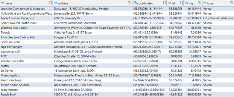
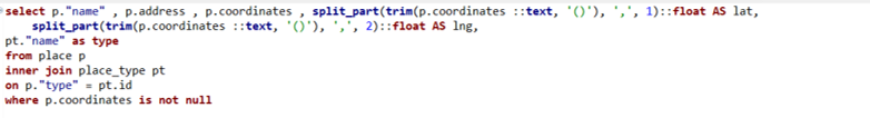
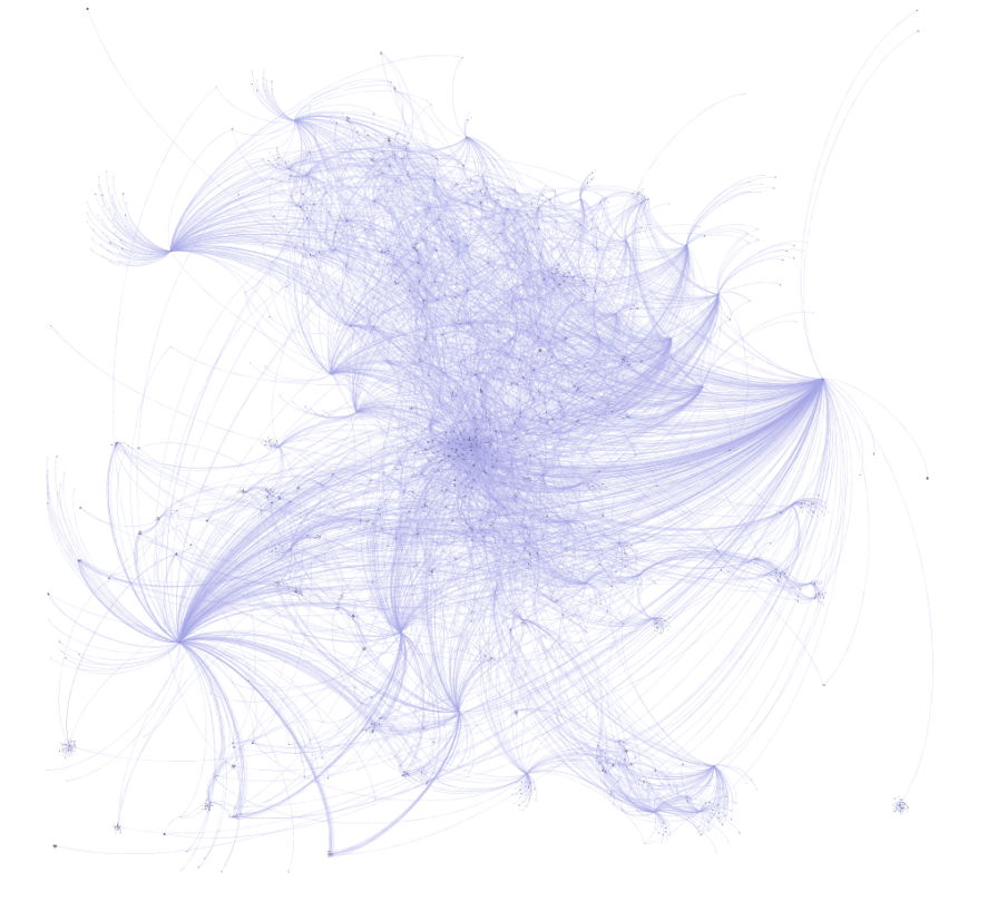
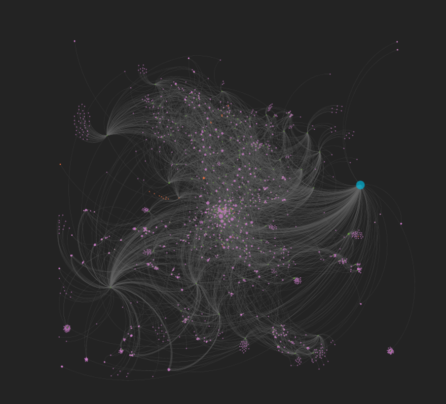
My last post showed a little bit about the musical genre data structure in the MusicBrainz database. In this post we’ll expand our view to include all genres and sub-genres, and look at a few visualization approaches using Flourish.

Flourish provides several options for visualizing hierarchical data; in this post we’ll look at some of the advantages and disadvantages of each approach. Ultimately, my goal is to categorize all my CDs and vinyl using this approach, but for now we’ll work with the MusicBrainz genre data.

We had a quick look at a sunburst chart in the prior post, so we’ll begin there with the much larger dataset we now have. How does it work?

Sunburst chart displaying all genres and sub-genres

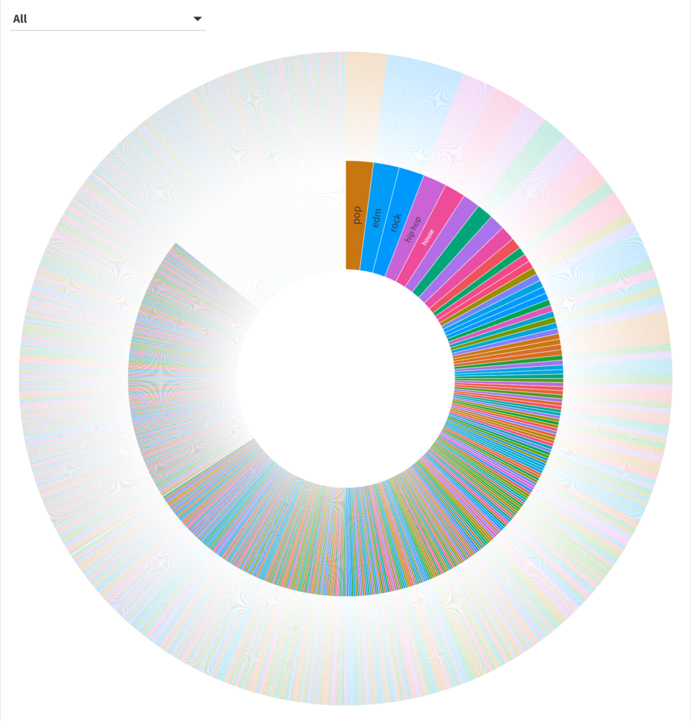
Hmmm…it’s a little challenging to see the data beyond the first few genres (these are the ones with the most sub-genres). We can narrow our focus by using the filter or by clicking on one of the inner circle genres. Let’s look at the rockgenre:

Sunburst chart for the rock genre

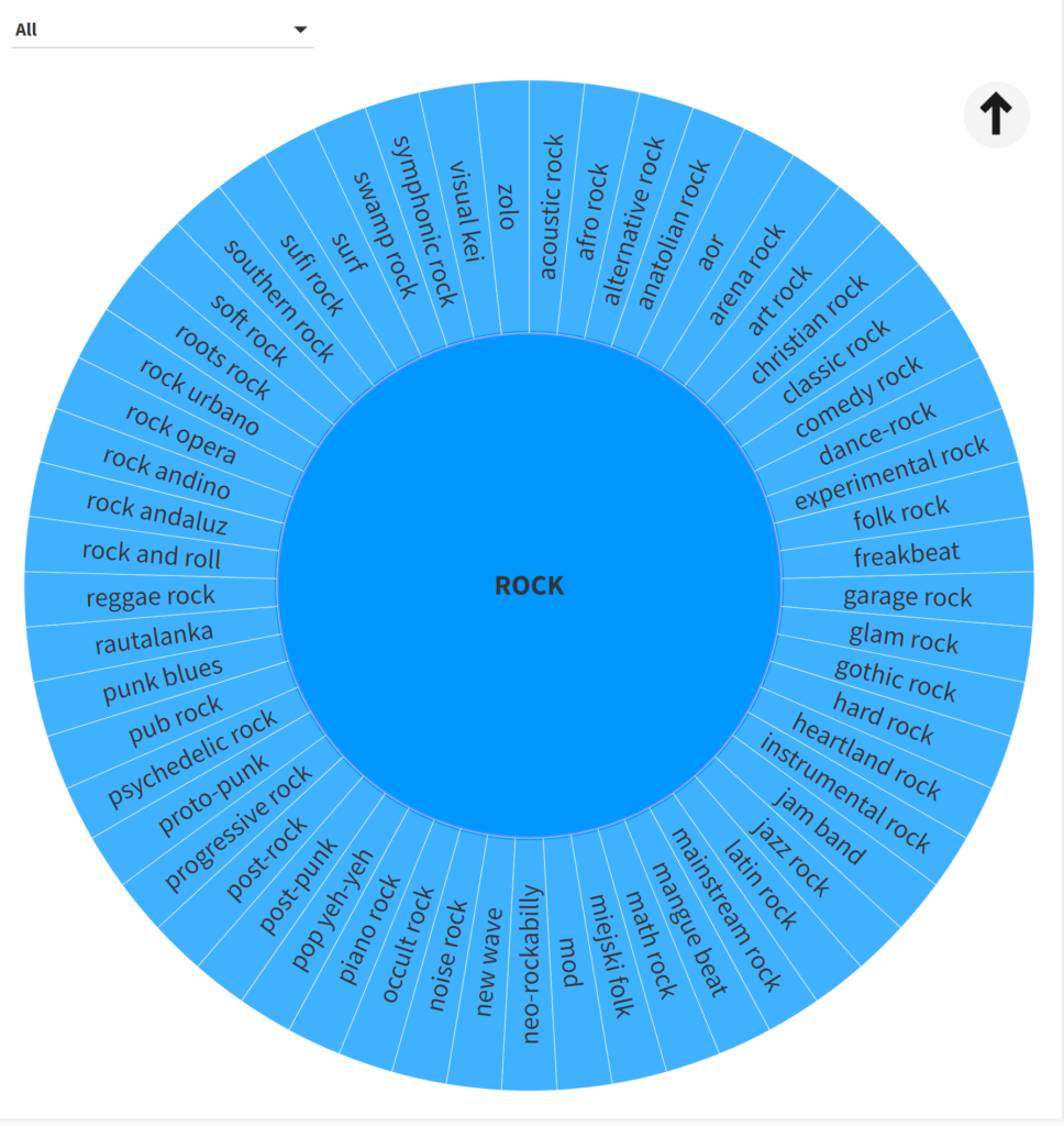
That’s a bit better; note that each sub-genre has an identical size here, something that will change once I feed my own music collection into Flourish. At least we can now identify all the sub-genres in the data.

What about a treemap approach? Treemaps can be useful in showing categories and sub-categories, sized by count or some other value (revenue, sales, profit, etc.). Here’s a look at all the data:

Treemap with all genres

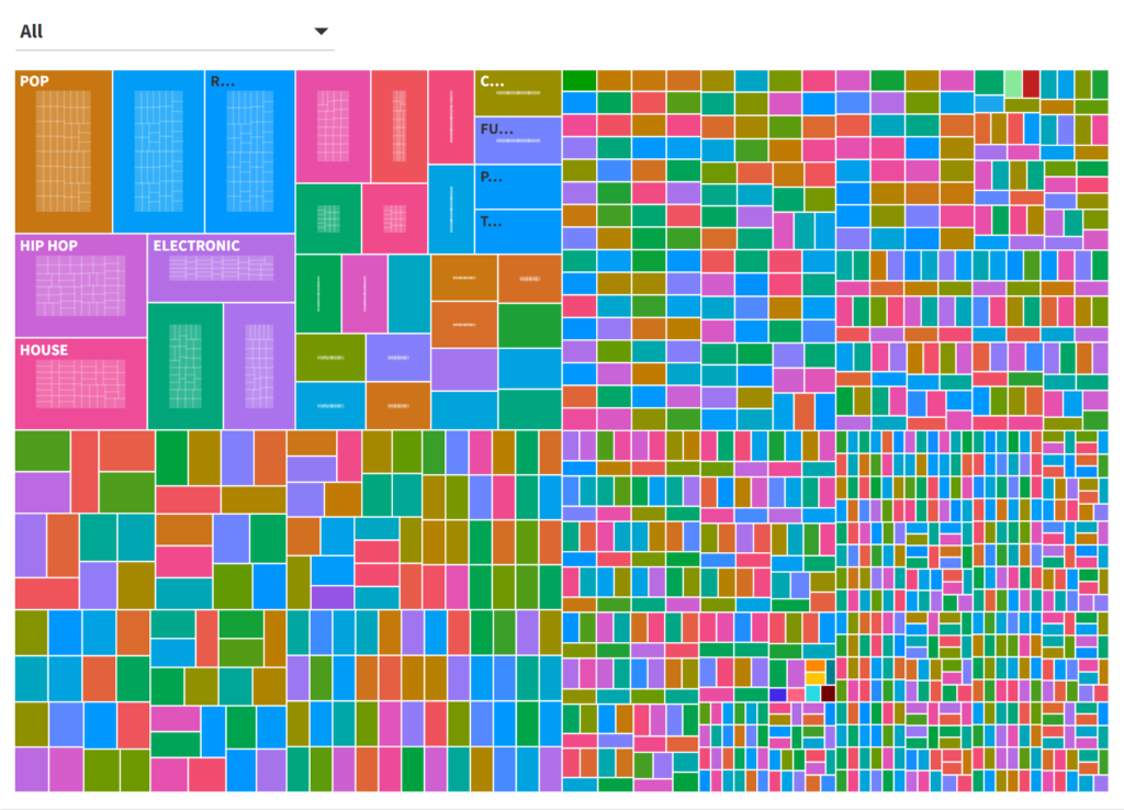
Once again, it’s a challenge to see anything beyond the most frequently occurring genres; even if we provide a pop-up label it’s not very user-friendly. Let’s filter down, this time in the electronicgenre:

Treemap filtered by electronic genre

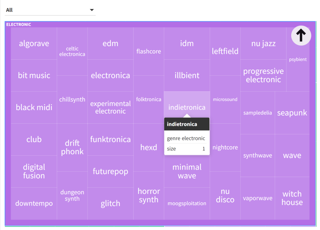
Here we get a similar result to the sunburst, albeit in a different layout. Again, this could be more interesting with an actual record collection, where each sub-genre would potentially be sized differently, with some not even appearing (i.e.- no recordings in a sub-genre).

Our next example will use circles, an approach sometimes known as circular packing. All genres will be arranged in a somewhat random layout, rather than the radial or rectangular formats we have just seen. Here is a look at all genres:

All genres in a circle layout

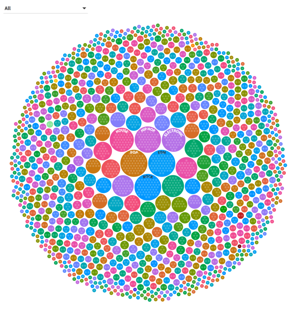
Once more, we have a similar issue to the sunburst and treemap displays, although it is fairly easy to see the highest frequency genres in the center. Filtering on the popgenre yields a series of identical sized circles for all pop sub-genres:

Circle chart for the pop genre

The circle approach is perhaps my least favorite of the three we have seen thus far, due to the seemingly more random placement of the individual circles.

At the opposite end of the spectrum we can use bars to view the same data. Here we are able to clearly see the rank order and relative frequency for each genre:

Partial view of all genres using bars

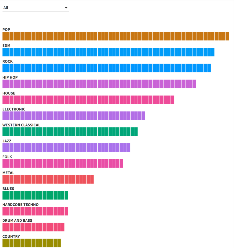
This looks really good for the high frequency genres – clear labels with easy to distinguish relative frequencies. The downside is when we have hundreds of genres; our bar chart becomes incredibly tall from top to bottom. In short, this approach will be effective for a limited number of genres, although the same could be said for the other methods.

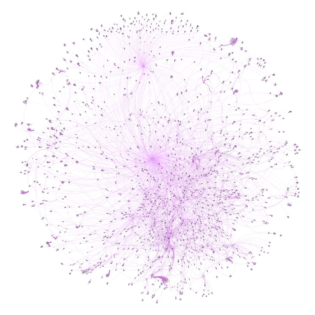
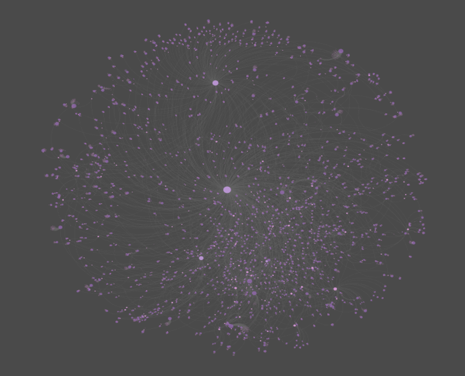
Our final approach uses a radial tree option in Flourish. This method most closely mimics the sunburst option, with results laid out in a circle; genres can then be clicked on or filtered to get to the sub-genre level. Here are all genres:

Radial axis chart with all genres

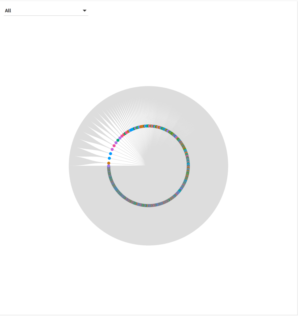
Not exactly helpful, is it? There are simply too many genres and sub-genres to display; even the sunburst chart provided more information at first glance. But what about when we select a single genre, such as reggae?

Radial tree for the reggae genre

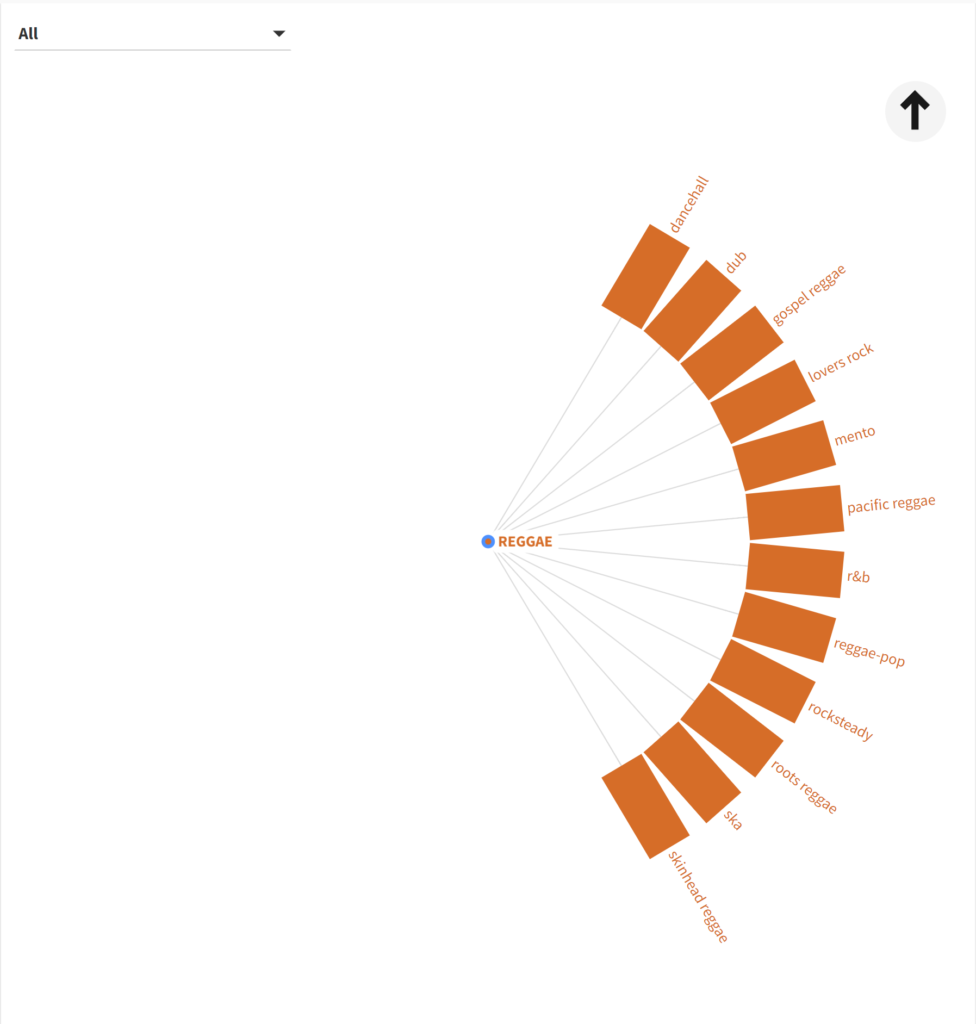
That’s better! We now have a clear, concise display to work with. This could prove to be useful when we have different size values for each sub-genre; in essence it will merge the best aspects of the sunburst and bar displays. I’ll be interested in seeing this sort of display when my music collection data is complete to see how well it handles differing sizes.

So which approach is best? I’m going to say that it depends on the underlying data; none of these charts was great when we attempted to view all genres at once, but they do appear to offer potential when the data has fewer categories (genres). Personally I like the sunburst and radial methods for the clarity of their display coupled with the visible connection between the sub-genres and the parent genre. I’m eager to see how they work with a more typical dataset.

That’s it for now – hope you enjoyed this, and thanks for reading!

Musical Genres via MusicBrainz Data

Once again I have pulled the core MusicBrainz tables into my local version of PostgreSQL, where I can start exploring all sorts of musical data – recordings, releases, places, artists, and much, much more. The database is large, totaling nearly 17 gigabytes of data across 171 tables, so there is no shortage of potential topics to explore.

One of the areas that intrigues me the most is an exploration of musical genres, created in MusicBrainz for contributors to categorize recordings. While the genres don’t currently tie in to individual recordings or releases in the database, I hope to use them with my own collection of music to create some potentially interesting visualizations. For now, let’s undertake an exploration of the raw data on genres, using the DBeaver database tool.

Our first table is simply named genre; let’s look at a screenshot of some of the data:

Data from the MusicBrainz genre table

Each genre has a unique id and gid value linked to a distinct genre name such as acid house, arena rock, or bebop. As you can tell, we’re going to a very specific level here, not simple classifications like pop, rock, or jazz. This should make it quite interesting (but not so easy!) when I start tagging my own music collection.

A second table is named genre_alias; here we find some examples where distinct names are rolled up to a single genre id to join to the genre table we just saw. For instance, have a look at some of the entries below:

Data from the MusicBrainz genre_alias table

We see multiple rows pointing to a single genre id (the genre column), largely based on alternative spellings or differing punctuation. The last three rows display one such case – alternative rap, alternative hip-hop, and alternative hiphop all have a genre value of 10; in the genre table this classifies all three as alternative hip hop. In other words, these entries are three possible variations on the original alternative hip hop genre; they all represent the same musical genre. In a sense, this is some data cleansing that I won’t need to perform.

A third table is named l_genre_genre; it ties together sub-genres with a higher level ‘umbrella’ genre. Using the alternative hip hop example from above, let’s dive into this table, where we can see the 10 value in the entity1field:

Alternative hip hop id in the entity1 column

Note the 199 value in the entity0 column; if we refer back to the genre table, here’s what we see:

Top level hip hop id in the genre table

The 199 id value corresponds to hip hop, which contains the alternative hip hop genre, as well as any other sub-genres related to hip hop. So entity0represents the higher level grouping, with entity1 representing the next level down (a sub-genre). In terms of classifying music, we can now use two levels, which may prove useful when it comes to building visualizations.

Is there anything we can visualize at this early stage? How about a very simple sunburst chart? These will become far more interesting when I can tag my own collection with genre info, but for now, here’s a conceptual look using Flourish. You can use the filter or click on a genre to focus the display.

I hope you can see the potential here; ultimately each genre and sub-genre will be sized based on the number of albums (vinyl & CD) in a collection. This will provide a quick visual indication for where someone’s musical preferences lie. There may even be the possibility to take it down to the single recording level, but we’ll have to test that idea.

That’s it for now; looking forward to doing some more fun stuff with the MusicBrainz data. Thanks for reading!

Checking Out the MusicBrainz API

For the last few year at JazzGraphs I’ve depended on the MusicBrainz database to draw data that populates many of the network graphs and other visualizations on the site. It’s an immense dataset that can be downloaded (as I’ve previously done) or accessed via the MusicBrainz API (Application Programming Interface). For upcoming visualizations, I’ve elected to go the API route, but simply as a means to access data, not to use in traditional API fashion. This approach allows for querying the topics I choose – specific artists, genres, recordings, etc. and pull down only the data needed to create a visualization.

Miles Davis Song Plots

In this blog we’re going to use Flourish with more MusicBrainz data to plot the length of Miles Davis songs on a range of vinyl releases. This type of data often suggests the use of a scatter plot with an x-y axis to best visualize the information. For instance, we could place record labels on the x-axis, and the length of each song (in seconds) on the y-axis. However, with record labels being a categorical variable (i.e.- discrete values such as Sony, Columbia, etc.) there are better options for understanding the data versus a true scatter plot.

The first of these is a boxplot, which provides the ability to see the distribution of data (song lengths) by record label. Let’s take a look at this data in Flourish:

Here we have limited the data display to a single label (showing all was quite messy!). Select CBS or Columbia to see labels with many Miles Davis releases. We now see the median length of a recording, as well as the 25th percentile (bottom of the box) and the 75th percentile (top of the box). It’s also easy to see individual songs that lie below or above the typical range; in statistical terms, these are called outliers. On our plot, they represent songs that are either much shorter than normal (below the extended line) or longer than normal (above the extended line).

This is all useful information, but presents some limitations. Boxplots are very good at doing the aggregations for us while obscuring the individual data values, especially values that lie inside the box. To improve our ability to see those values we turn to a violin plot, which excels at showing the shape of a distribution, rather than the fixed shape provided by the boxplot. We have also combined a beeswarm plot with the violin plot so we can see every individual value:

Again, select CBS or Columbia to view a label with many releases/songs to understand why we elected to use this approach. Hover over individual points to learn more about an individual song – it’s length, release, artist, label, and song title. For me, this approach is best if I’m trying to explore the data; the boxplot is great when I’m interested in overall patterns. Both are powerful tools suited to their individual strengths.

I’ll be using Flourish to interrogate the MusicBrainz data further in future posts, but that’s it for now. Thanks for reading!

Miles Davis Sunburst Visualization

With the Christmas holiday chaos (somewhat literally this year) in the rearview, I’ve been playing a bit with the MusicBrainz data and the Flourish visualization library. First up was using some repurposed code to visualize Miles Davis recordings. I thought a sunburst diagram might be an interesting way to show album releases and the songs on each release. Turns out it wasn’t quite as simple as I thought…it never is!

After multiple query tweaks and iterations, I’ve got something fun and interesting. Miles produced so much music, with much of it re-released in multiple formats (think vinyl vs. cd) and in various collections, factors that wound up influencing my query and chart logic. As is the case for many jazz artists, multiple labels are an issue, so why not create a filter to view releases for each label (Columbia, Blue Note, etc.)? And many songs turn up on multiple releases (studio, live, collections), so we need to account for that as well.

So my thought with using a sunburst was to group songs and releases together, and allow filtering by label. Mind you, it took multiple attempts to get the data in the best format, but we eventually wound up with something workable to feed the sunburst chart.

If you aren’t familiar with the sunburst chart, here’s a quick primer. The goal of a sunburst chart is to display hierarchical information in a circular layout with 2 or 3 levels (typically). The outer layer has more surface area to work with, and successive inner layers each have less visual space to use. For this reason, I wound up using individual songs in the outermost layer, with their respective albums as the inner layer. With an average of perhaps 5-10 songs per album, this takes advantage of the sunburst hierarchy framework.

Here’s what the code eventually became, after multiple iterations:

SELECT distinct ac.name AS artist, l.label_code, l.name AS label_name, r.name AS release, mf.name AS format, t.name AS id, t.name AS label, t.name AS name,
r.name AS recording,
CASE WHEN t.length < 180000 THEN ‘< 3 Minutes’ WHEN t.length < 300000 THEN ‘3-5 Minutes’ WHEN t.length < 420000 THEN ‘5-7 Minutes’ WHEN t.length < 600000 THEN ‘7-10 Minutes’ WHEN t.length > 600000 THEN ’10+ Minutes’
ELSE ‘No Length’ END category

FROM public.release r
INNER JOIN public.artist_credit ac
ON r.artist_credit = ac.id
INNER JOIN public.medium m
ON r.id = m.release
INNER JOIN public.medium_format mf
ON m.format = mf.id
INNER JOIN public.release_label rl
ON r.id = rl.release
INNER JOIN public.label l
ON rl.label = l.id
INNER JOIN public.track t
ON m.id = t.medium
INNER JOIN public.recording re
ON t.recording = re.id

WHERE r.artist_credit = 1954
and mf.name = ’12” Vinyl’

ORDER BY l.name, r.name

What we’re doing here, in a nutshell, is retrieving all the information for Miles Davis’ 12″ vinyl releases; many of these recordings were eventually released on CD, so we’re attempting to avoid duplication here. The ‘r.artist_credit = 1954’ line refers to Miles Davis and his MusicBrainz artist ID, while the medium_format name field is set to grab just 12″ vinyl releases.

Enough of the technical details – let’s view some results:

Here’s a look at the dropdown filter we created using labels:

Miles Davis sunburst labels filter

Note that we ordered our query by both label name and release name; this translates to an alpha sorted dropdown on labels, making it much more intuitive to select a specific label. We can choose to display all labels, but that gets rather messy for an artist like Miles who recorded for or was re-released by many companies. Let’s filter it down to Columbia, a major label who Miles recorded for many times:

Miles Davis Columbia releases

The inner circle displays individual releases, of which there are many, while the outer ring displays the songs on each release. The Flourish sunburst charts are interactive, but it’s a challenge to see what’s going on in our static image. Let’s move to the Blue Note label, a major force in jazz, but one where Miles was not a major player:

Miles Davis Blue Note releases

Now we can see the layout, with album releases surrounded by individual songs. We can go a step further by clicking on the Miles Davis, Volume 1 layer, which reveals the following:

Miles Davis Blue Note drilldown

Now we are focused strictly on that release and can easily view the songs on that album. Hope you get the general idea for how the sunburst charts work. Now have a go at it yourself with the live version:

I’ll have more of these to come, as it feels like a great way to capture a lot of information in a fun, interactive layout. See you soon, and thanks for reading!

Music Venues – Interactive Maps

As a follow-up to my last post on mapping music venues using the great MusicBrainz database, I am adding interactive versions of the maps for you to explore. First up is the cluster map showing aggregations of venues across the globe. Scroll in and out to view more or less detail:

The second map view uses a categorical approach, coloring each venue by it’s specific type (arena, stadium, etc.) and provides additional information when a venue is selected. As you scroll in the specific venues become more visible:

Have fun exploring, and watch for new maps coming soon!

Music Venues Mapped

The last two weeks have been quite involved with updating my local database with data from the amazing MusicBrainz site. If you’re not familiar with MusicBrainz, it is a bit of a wiki for musical data, including artists, releases, places, and so much more. It’s a truly impressive data source, and it is, of course, very large from a data perspective.

While this site is skewed toward jazz, it would be a shame not to dabble in some other genres; after all, I have spent my share of time listening to classical, rock, Americana, and a few more styles of music. I’ll begin with a simple mapping of all the places (not just jazz venues) in MusicBrainz with lat/lng coordinates, using my old friend Carto to do the display work.

Let’s start by viewing a set of the raw data from the place table using DBeaver:

Data sample of MusicBrainz places

Here you get an idea of useful information we can pull from the place table; name, address, coordinates, and type, plus new fields created in the query for latitude and longitude. Carto (plus Mapbox and other mapping platforms) requires latitude and longitude attributes in order to map the data. Here’s the simple code used to extract this information:

Code to create lat/lng attributes

After creating a .csv export file, the data is uploaded to Carto, where we can begin mapping the information in a variety of ways. Since the places dataset is quite large (21k records with coordinates), a cluster map might prove useful. Carto allows for setting some options, including bubble and text sizes to optimize the display. Cluster maps aggregate the information at high levels, and then allow us to scroll in on the information at a more localized level. Here is the Carto menu:

Setting cluster options in Carto

Here’s a very high level display using the cluster option:

Top level of the place cluster map

As we scroll in, the bubbles will change into smaller aggregations:

Scrolling in on the place cluster map

At the deepest level of scrolling, every place in the data file will display as a single point at it’s respective lat/lng coordinates:

Lowest level of the place cluster map

This is fun to see how the data is aggregated and ultimately dispersed at lower and lower levels, but it comes with some limitations, including the inability to see any identifying details at the individual place level. To see this information, we’ll need a different Carto visualization.

Let’s investigate the category option, which allows for the addition of labels and the coloring of attributes by a specific category. We select the categorywizard, and choose the type column to be used for coloring markers on the map.

Setting Carto category map options

Here’s what we see at a very high level – lots of individual markers (and colors) that are not consolidated as they were with the cluster approach.

High level view of the place category map with type colors

The positive trade-off comes when we select any individual marker, where we have set up the info window to display the name, type, and address:

An individual place with detailed information

This was a simple overview for how we can visualize the place data; in future posts I look forward to exploring some more interesting uses of this rich geographic data. Thanks for reading!

ECM Label Network

One of the great strengths of the MusicBrainz database is that we can build networks using not only artists, but also record labels, or even individual songs. In this post, we’re going to explore an example (per a reader suggestion) using the ECM label and its variants. ECM is known for producing high quality recordings from an array of both jazz and classical artists. Keith Jarrett, Charles Lloyd, and Gary Burton are among some of the better known artists with multiple ECM recordings.

In contrast to our Miles Davis network, where the focus was on the artist, we now wish to see the labels (ECM) as hubs within the network. We’ll take a similar approach to constructing the node and edges files, although we now are going to create a multi-modal structure with 4 layers: Label –> Artist –> Release –> Songs. Using PostgreSQL, we can pull this data quite easily from the MusicBrainz database. Let’s start with the nodes logic:

SELECT a.*
FROM
((SELECT CONCAT(l.name, ‘ (Label)’) AS id, l.name AS name, l.name AS label, ‘Label’ AS type, 30 AS size
FROM label l
WHERE l.id IN(46800,1884,106711,123517))

UNION ALL

(SELECT CONCAT(ac.name, ‘ (Artist)’) AS id, ac.name AS name, ac.name AS label, ‘Artist’ AS type, 10 AS size

FROM public.release r
INNER JOIN public.artist_credit ac
ON r.artist_credit = ac.id
INNER JOIN public.medium m
ON r.id = m.release
INNER JOIN public.medium_format mf
ON m.format = mf.id
INNER JOIN public.release_label rl
ON r.id = rl.release
INNER JOIN public.label l
ON rl.label = l.id

WHERE l.id IN(46800,1884,106711,123517))

UNION ALL

(SELECT CONCAT(r.name, ‘ (Release)’) AS id, r.name AS name, r.name AS label, ‘Release’ AS type, COUNT(DISTINCT rl.release) AS size

FROM public.release r
INNER JOIN public.release_label rl
ON r.id = rl.release
INNER JOIN public.label l
ON rl.label = l.id

WHERE l.id IN(46800,1884,106711,123517)
GROUP BY r.name
)

UNION ALL

(SELECT CONCAT(ta.name, ‘ (Song)’) AS id, ta.name AS name, ta.name AS label, ‘Song’ AS type, COUNT(DISTINCT rl.release)
AS Size
FROM public.release r
INNER JOIN public.artist_credit ac
ON r.artist_credit = ac.id
INNER JOIN public.medium m
ON r.id = m.release
INNER JOIN public.medium_format mf
ON m.format = mf.id
INNER JOIN public.release_label rl
ON r.id = rl.release
INNER JOIN public.label l
ON rl.label = l.id
INNER JOIN public.track t
ON m.id = t.medium
INNER JOIN public.track_aggregate ta
ON t.name = ta.name

WHERE l.id IN(46800,1884,106711,123517)

GROUP BY ta.name
)) a

The four sections of code are united by one common attribute – the four record label identifiers associated with ECM. Section 1 creates nodes for the record labels, section 2 the recording artists, section 3 the releases, and section 4 the songs on each release. This should give us a very interesting network, although it will not have the same level of cross-pollination as the earlier Miles Davis network, as the songs are being associated with specific releases.

Creating the edges is quite similar, albeit requiring just three sections of code:

SELECT a.*
FROM
((SELECT CONCAT(l.name, ‘ (Label)’) AS source, CONCAT(ac.name, ‘ (Artist)’) AS Target, ‘Label’ AS source_type, ‘Artist’ AS target_type
FROM public.label l
INNER JOIN public.release_label rl
ON l.id = rl.label
INNER JOIN public.release r
ON rl.release = r.id
INNER JOIN public.artist_credit ac
ON r.artist_credit = ac.id

WHERE l.id IN(46800,1884,106711,123517))

UNION ALL

(SELECT CONCAT(ac.name, ‘ (Artist)’) AS Source, CONCAT(r.name, ‘ (Release)’) AS Target, ‘Artist’ AS source_type, ‘Release’ AS target_type
FROM public.release r
INNER JOIN public.release_label rl
ON r.id = rl.release
INNER JOIN public.artist_credit ac
ON r.artist_credit = ac.id
INNER JOIN public.label l
ON l.id = rl.label

WHERE l.id IN(46800,1884,106711,123517))

UNION ALL

(SELECT CONCAT(r.name, ‘ (Release)’) AS Source, CONCAT(ta.name, ‘ (Song)’) AS Target, ‘Release’ AS source_type, ‘Song’ AS target_type
FROM public.release r
INNER JOIN public.release_label rl
ON r.id = rl.release
INNER JOIN public.artist_credit ac
ON r.artist_credit = ac.id
INNER JOIN public.label l
ON l.id = rl.label
INNER JOIN public.medium m
ON r.id = m.release
INNER JOIN public.track t
ON m.id = t.medium
INNER JOIN public.track_aggregate ta
ON t.name = ta.name

WHERE l.id IN(46800,1884,106711,123517))
) a
GROUP BY a.source, a.target, a.source_type, a.target_type

Here we are simply connecting labels to artists, artists to releases, and releases to songs. Both the node and edge results are saved to .csv files for use in Gephi.

Once the data was in Gephi, I spent parts of a few days testing layouts, spacing, colors, sizing, and so on, before settling for the moment on using the popular Force Atlas 2 algorithm. I find it useful to start the process using the rapid (and less precise) OpenOrd algorithm whenever working with a fairly complex or large dataset. Then, once the basic network structure is revealed, we can move on to Yifan Hu, Force Atlas, or any of the more precise methods.

For the (for now) final version, I elected to size the nodes based on the number of outbound degrees, which will place more visual emphasis on the record labels and releases, respectively. Artists with multiple releases will also be represented by slightly larger nodes. So here are two versions, the first in Gephi:

The second version is from the web, after tweaking settings in sigma.js:

To interact with the network, click here. Thanks for reading!

Building JazzGraphs, Part 1

As the initial versions of my JazzGraphs networks are being tested, I thought this would be an appropriate time to walk through the process I use for moving the data from raw database form to the eventual network graph output shared on this site. Mind you, I am still iterating through the data, testing what works best for graph creation, and otherwise seeking to create some memorable output that pays homage to many of the great jazz artists of the last 100 years. Ultimately, the process could change a bit, but it feels like things are pretty stable for the moment. So here goes with a basic outline for the steps currently being taken to create the graphs.

Of course it all starts with the data. Without a good data source, these graphs would be tremendously challenging to create. One could do some web scraping, endless Google searches, or even go old school with trips to the local library. None of these approaches are efficient nor would they yield the amount of data I would like to have for this project. Enter MusicBrainz, a quite remarkable site devoted to building the most comprehensive source of all things musical. Their stated mission is to be:

    1. The ultimate source of music information by allowing anyone to contribute and releasing the data under open licenses.
    2. The universal lingua franca for music by providing a reliable and unambiguous form of music identification, enabling both people and machines to have meaningful conversations about music.

While the content in any such site is never perfect (think Wikipedia), it nonetheless provides a fantastic starting point for projects such as JazzGraphs.

Fortunately for me (and other SQL coders), the MusicBrainz database is available in a PostgreSQL format, which is very similar to the MySQL databases more familiar to me. So the learning curve has been anything but steep in technical terms. The greater challenge has come in the sheer number of tables and fields in the database, and figuring out which ones are highly populated versus the ones intended for future growth. Another interesting aspect is the multiple spelling variations available for a single song or even an album release. Such are the challenges with public contributions; fortunately they are more than offset by the impressive level of detail available for many artists.

To add some visual perspective, here’s a view of the MusicBrainz schema I am tapping into for the JazzGraphs data:

So now you have a basic idea for what the database looks like, how joins are implemented, and how the general naming conventions work. Much of the artist information is found in the upper left of the diagram, with release details in the lower left. Works (songs) can be seen in the lower right quadrant, while the upper right is largely concerned with location and label information. Note that this is but a small subset of the more than 300 tables in the database.

Once the data is available, the challenge is to understand all the relationships within the data, as well as where to find the most robust tables and fields. As I noted earlier, not all tables are populated equally at this point, so it is critical to work within the framework of what’s currently in the database. Fortunately, for a prominent artist such as Miles Davis, we find plenty of data in some of the key tables. This enabled me to begin testing SQL code, and to also envision how I might wish to display the data in a network graph. After a few rounds of testing, I arrived at the conclusion that using a tri-modal approach might be the best approach. In other words, the artist (Miles Davis, in this case) connects directly to specific releases (an album or CD), which in turn connect directly to the songs on the release. What makes this approach appealing is the fact that many songs show up on multiple releases; otherwise, we would wind up with a simple hierarchical (think organization chart) output, and that wouldn’t be much fun 🙂 .

The next step is to create output for use in Gephi. Recall that in most cases, network graphs require both node and edge inputs. What do these represent in our current case? Since nodes are the graphical representation of specific objects or entities, we have three types in this analysis:

    1. The artist (Miles Davis)
    2. All releases (Kind of Blue, Bitches Brew, etc.)
    3. All songs (So What, Milestones, etc.)

Each of these elements should have a single node; we can later adjust for frequency by sizing the nodes in our graph. For example, if ‘So What’ shows up on 20 releases, we want to display a single node that connects to each of those releases, and then size the node based on frequency. More on that in a bit. So our initial code will focus on creating these nodes, as shown below, using a UNION query to place all of our nodes in a single result, which can then be exported to a .csv file for Gephi to ingest. Here’s the code:

SELECT a.*
FROM
((SELECT CONCAT(ac.name, ‘ (Artist)’) AS id, ac.name AS name, ac.name AS label, ‘Artist’ AS type, 50 AS size

FROM public.artist_credit ac

WHERE ac.id = 1954)

UNION ALL

(SELECT CONCAT(r.name, ‘ (Release)’) AS id, r.name AS name, r.name AS label, ‘Release’ AS type, COUNT(DISTINCT rl.release) AS size

FROM public.release r
INNER JOIN public.artist_credit ac
ON r.artist_credit = ac.id
INNER JOIN public.medium m
ON r.id = m.release
INNER JOIN public.medium_format mf
ON m.format = mf.id
INNER JOIN public.release_label rl
ON r.id = rl.release
INNER JOIN public.label l
ON rl.label = l.id

WHERE r.artist_credit = 1954
GROUP BY r.name
)

UNION ALL

(SELECT CONCAT(ta.name, ‘ (Song)’) AS id, ta.name AS name, ta.name AS label, ‘Song’ AS type, COUNT(DISTINCT rl.release)
AS Size
FROM public.release r
INNER JOIN public.artist_credit ac
ON r.artist_credit = ac.id
INNER JOIN public.medium m
ON r.id = m.release
INNER JOIN public.medium_format mf
ON m.format = mf.id
INNER JOIN public.release_label rl
ON r.id = rl.release
INNER JOIN public.label l
ON rl.label = l.id
INNER JOIN public.track t
ON m.id = t.medium
INNER JOIN public.track_aggregate ta
ON t.name = ta.name

WHERE r.artist_credit = 1954
GROUP BY ta.name
)) a

As you may have gathered, the ‘1954’ value for the artist_credit corresponds with Miles Davis’ unique id in the database. The beauty of this code is that we need only modify that id in each of the 3 code sections to pull the same type of detail for another artist. So our code is highly reusable. Once our results have been returned, we simply export the results to a .csv format.

Now that the node code has been completed, it’s time to focus on the creation of edges, the connections between nodes. In this case, we want releases to connect only to the artist, and songs to connect only to releases. Once again we’ll use SQL UNION logic to merge results from each section into a single set of results for use in Gephi. Here’s a look at the code for edge creation:

SELECT a.*
FROM
((SELECT CONCAT(ac.name, ‘ (Artist)’) AS source, CONCAT(r.name, ‘ (Release)’) AS Target, ‘Artist’ AS source_type, ‘Release’ AS target_type
FROM public.artist_credit ac
INNER JOIN public.release r
ON ac.id = r.artist_credit
INNER JOIN public.release_label rl
ON r.id = rl.release
WHERE ac.id = 1954)

UNION ALL

(SELECT CONCAT(r.name, ‘ (Release)’) AS Source, CONCAT(ta.name, ‘ (Song)’) AS Target, ‘Release’ AS source_type, ‘Song’ AS target_type
FROM public.release r
INNER JOIN public.release_label rl
ON r.id = rl.release
INNER JOIN public.medium m
ON r.id = m.release
INNER JOIN public.track t
ON m.id = t.medium
INNER JOIN public.track_aggregate ta
ON t.name = ta.name

WHERE r.artist_credit = 1954)) a
GROUP BY a.source, a.target, a.source_type, a.target_type

Pretty simple – in the first section, the artist represents the source node, and all releases become the target nodes (source and target values are essential to Gephi edge creation). The second section adds releases as the source nodes, and songs as target nodes. This will give us the tri-modal network structure I spoke of earlier.

Next comes the fun part (not to say that coding can’t be fun 🙂 ) where we start to use Gephi to create our network. The next post will examine how we pull the data into Gephi and start creating our network. Hope you found this informative and helpful, and thanks for reading!

Visualizing Miles

I’ve been spending some time working with data from the MusicBrainz site, and exploring various ways to create networks using Gephi. My initial explorations focus on the vast musical network of Miles Davis, as seen through album releases and the many songs Miles recorded. Here’s a look at one such iteration, wherein Miles is connected to releases, which are in turn connected to songs. Of course, many of the songs are associated with multiple releases, making for an interesting graph displaying all the connections between artist, releases, and songs.

Miles can be found to the far right of this graph, with dozens of connections flowing outbound to his many releases. In the web-based version below (built using sigma.js), we can see a bit more detail and structure in the network:

Now Miles can be seen clearly, as we have enlarged his node to draw attention to him as the focal point of the network. We can also begin to see some of the most frequently released songs as larger pink circles. Tunes like ‘So What’ and ‘Milestones’ appear on many releases, and are sized accordingly. Of course, one of the best aspects of deploying the network to the web is the ability to offer interactivity, where users can zoom, pan, click, and otherwise navigate the network to learn more. If you wish to do so, click here to open the network in a new tab.

Note that this is an unfinished product at this point, despite being several iterations in the making. I have yet to resolve spelling differences that make one song appear to be many different tunes (‘Round Midnight is a classic example), and I also plan to make some other modifications. Having said that, it feels like we’re close to a working template that will allow for depicting the networks of so many of the heroes of jazz – Coltrane, Monk, Ellington, Parker, Mingus, and many more.

So stay tuned for periodic updates and improvements, and thanks for reading!