Tag: Miles Davis

Miles Davis Song Plots

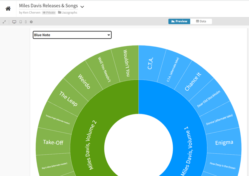
In this blog we’re going to use Flourish with more MusicBrainz data to plot the length of Miles Davis songs on a range of vinyl releases. This type of data often suggests the use of a scatter plot with an x-y axis to best visualize the information. For instance, we could place record labels on the x-axis, and the length of each song (in seconds) on the y-axis. However, with record labels being a categorical variable (i.e.- discrete values such as Sony, Columbia, etc.) there are better options for understanding the data versus a true scatter plot.

The first of these is a boxplot, which provides the ability to see the distribution of data (song lengths) by record label. Let’s take a look at this data in Flourish:

Here we have limited the data display to a single label (showing all was quite messy!). Select CBS or Columbia to see labels with many Miles Davis releases. We now see the median length of a recording, as well as the 25th percentile (bottom of the box) and the 75th percentile (top of the box). It’s also easy to see individual songs that lie below or above the typical range; in statistical terms, these are called outliers. On our plot, they represent songs that are either much shorter than normal (below the extended line) or longer than normal (above the extended line).

This is all useful information, but presents some limitations. Boxplots are very good at doing the aggregations for us while obscuring the individual data values, especially values that lie inside the box. To improve our ability to see those values we turn to a violin plot, which excels at showing the shape of a distribution, rather than the fixed shape provided by the boxplot. We have also combined a beeswarm plot with the violin plot so we can see every individual value:

Again, select CBS or Columbia to view a label with many releases/songs to understand why we elected to use this approach. Hover over individual points to learn more about an individual song – it’s length, release, artist, label, and song title. For me, this approach is best if I’m trying to explore the data; the boxplot is great when I’m interested in overall patterns. Both are powerful tools suited to their individual strengths.

I’ll be using Flourish to interrogate the MusicBrainz data further in future posts, but that’s it for now. Thanks for reading!

Miles Davis Sunburst Visualization

With the Christmas holiday chaos (somewhat literally this year) in the rearview, I’ve been playing a bit with the MusicBrainz data and the Flourish visualization library. First up was using some repurposed code to visualize Miles Davis recordings. I thought a sunburst diagram might be an interesting way to show album releases and the songs on each release. Turns out it wasn’t quite as simple as I thought…it never is!

After multiple query tweaks and iterations, I’ve got something fun and interesting. Miles produced so much music, with much of it re-released in multiple formats (think vinyl vs. cd) and in various collections, factors that wound up influencing my query and chart logic. As is the case for many jazz artists, multiple labels are an issue, so why not create a filter to view releases for each label (Columbia, Blue Note, etc.)? And many songs turn up on multiple releases (studio, live, collections), so we need to account for that as well.

So my thought with using a sunburst was to group songs and releases together, and allow filtering by label. Mind you, it took multiple attempts to get the data in the best format, but we eventually wound up with something workable to feed the sunburst chart.

If you aren’t familiar with the sunburst chart, here’s a quick primer. The goal of a sunburst chart is to display hierarchical information in a circular layout with 2 or 3 levels (typically). The outer layer has more surface area to work with, and successive inner layers each have less visual space to use. For this reason, I wound up using individual songs in the outermost layer, with their respective albums as the inner layer. With an average of perhaps 5-10 songs per album, this takes advantage of the sunburst hierarchy framework.

Here’s what the code eventually became, after multiple iterations:

SELECT distinct ac.name AS artist, l.label_code, l.name AS label_name, r.name AS release, mf.name AS format, t.name AS id, t.name AS label, t.name AS name,
r.name AS recording,
CASE WHEN t.length < 180000 THEN ‘< 3 Minutes’ WHEN t.length < 300000 THEN ‘3-5 Minutes’ WHEN t.length < 420000 THEN ‘5-7 Minutes’ WHEN t.length < 600000 THEN ‘7-10 Minutes’ WHEN t.length > 600000 THEN ’10+ Minutes’
ELSE ‘No Length’ END category

FROM public.release r
INNER JOIN public.artist_credit ac
ON r.artist_credit = ac.id
INNER JOIN public.medium m
ON r.id = m.release
INNER JOIN public.medium_format mf
ON m.format = mf.id
INNER JOIN public.release_label rl
ON r.id = rl.release
INNER JOIN public.label l
ON rl.label = l.id
INNER JOIN public.track t
ON m.id = t.medium
INNER JOIN public.recording re
ON t.recording = re.id

WHERE r.artist_credit = 1954
and mf.name = ’12” Vinyl’

ORDER BY l.name, r.name

What we’re doing here, in a nutshell, is retrieving all the information for Miles Davis’ 12″ vinyl releases; many of these recordings were eventually released on CD, so we’re attempting to avoid duplication here. The ‘r.artist_credit = 1954’ line refers to Miles Davis and his MusicBrainz artist ID, while the medium_format name field is set to grab just 12″ vinyl releases.

Enough of the technical details – let’s view some results:

Here’s a look at the dropdown filter we created using labels:

Miles Davis sunburst labels filter

Note that we ordered our query by both label name and release name; this translates to an alpha sorted dropdown on labels, making it much more intuitive to select a specific label. We can choose to display all labels, but that gets rather messy for an artist like Miles who recorded for or was re-released by many companies. Let’s filter it down to Columbia, a major label who Miles recorded for many times:

Miles Davis Columbia releases

The inner circle displays individual releases, of which there are many, while the outer ring displays the songs on each release. The Flourish sunburst charts are interactive, but it’s a challenge to see what’s going on in our static image. Let’s move to the Blue Note label, a major force in jazz, but one where Miles was not a major player:

Miles Davis Blue Note releases

Now we can see the layout, with album releases surrounded by individual songs. We can go a step further by clicking on the Miles Davis, Volume 1 layer, which reveals the following:

Miles Davis Blue Note drilldown

Now we are focused strictly on that release and can easily view the songs on that album. Hope you get the general idea for how the sunburst charts work. Now have a go at it yourself with the live version:

I’ll have more of these to come, as it feels like a great way to capture a lot of information in a fun, interactive layout. See you soon, and thanks for reading!

We’re Back!

After a 4-year(!) absence, I’m trying to get back in the groove with the Jazzgraphs site. The first step is to update the data tables behind the scenes, using data from the MusicBrainz project, a sort of Wikipedia for music information. The potential is enormous, but involves some effort on my end to get things rolling again.

MusicBrainz provides an amazing array of data covering artists, recordings, labels, etc. that can be leveraged for some fun visualizations. For now, I’m in the midst of the data wrangling stage, updating each table with the freshest data available so I can stay up to date. BTW, the data extends well beyond jazz, so get ready for some visualizations that extend the boundaries a bit.

The plan is to get the data refreshed over the next week, and then to start building some interesting networks covering pivotal artists; in the past I did some work presenting networks for Charles Mingus, Miles Davis, and the ECM label.

Mingus:

Charles Mingus musical network

Miles:

Miles Davis album and musician network

ECM:

ECM Graph

Stay tuned for some fresh new work in the coming weeks and months!

Visualizing Miles, Part 2

One of my favorite aspects of working with web projects is the ability to use CSS to customize a page. This is especially the case when working with sigma.js for the deployment of network graphs. CSS makes it easy to quickly test and change colors, modify elements, and experiment with different fonts. This is all important when I’m seeking a particular look and feel for a visualization. Which leads into this updated take on my recently created Miles Davis network graph, wherein the node colors, edge widths, and font sizes have all been modified, for the better, I believe.

In place of the nearly black background is a deep, rich blue, as well as new node colors and a more readable font color for the sidebar. Here are the before and after views:


And the updated look:


Visualizing Miles

I’ve been spending some time working with data from the MusicBrainz site, and exploring various ways to create networks using Gephi. My initial explorations focus on the vast musical network of Miles Davis, as seen through album releases and the many songs Miles recorded. Here’s a look at one such iteration, wherein Miles is connected to releases, which are in turn connected to songs. Of course, many of the songs are associated with multiple releases, making for an interesting graph displaying all the connections between artist, releases, and songs.

Miles can be found to the far right of this graph, with dozens of connections flowing outbound to his many releases. In the web-based version below (built using sigma.js), we can see a bit more detail and structure in the network:

Now Miles can be seen clearly, as we have enlarged his node to draw attention to him as the focal point of the network. We can also begin to see some of the most frequently released songs as larger pink circles. Tunes like ‘So What’ and ‘Milestones’ appear on many releases, and are sized accordingly. Of course, one of the best aspects of deploying the network to the web is the ability to offer interactivity, where users can zoom, pan, click, and otherwise navigate the network to learn more. If you wish to do so, click here to open the network in a new tab.

Note that this is an unfinished product at this point, despite being several iterations in the making. I have yet to resolve spelling differences that make one song appear to be many different tunes (‘Round Midnight is a classic example), and I also plan to make some other modifications. Having said that, it feels like we’re close to a working template that will allow for depicting the networks of so many of the heroes of jazz – Coltrane, Monk, Ellington, Parker, Mingus, and many more.

So stay tuned for periodic updates and improvements, and thanks for reading!

Welcome to JazzGraphs!

Welcome to the JazzGraphs website! This site will feature a variety of visualizations documenting the fascinating history of jazz music – the artists, labels, and recordings that make up this great American art form.

My goal is to apply my data visualization skills to create memorable images that capture the amazing history of jazz music in ways that are creative, innovative, and visually gorgeous. Here’s one example to provide an idea where this site is headed:

This is a snapshot of a network graph detailing the studio albums of jazz legend Miles Davis, along with all of the sidemen playing on each recording. Many of the visualizations will take this general form, but other data visualization approaches will also be utilized. Lots of the graphs will be interactive, allowing you to have a fun exploring the myriad relationships surrounding an artist, label, or recording.

The eventual goal will be to turn some of these graphs into printed posters and a book sometime in 2018. More details on timing to follow in future posts.