After a weekend trying multiple approaches at incorporating images of jazz musicians as backgrounds to their network graphs, I finally hit on a good solution – create icon-like images that display in the upper left corner of the graph background. This allows the network to be easily viewed on multiple devices ranging from phones to widescreen monitors, without interfering with any of the network elements.
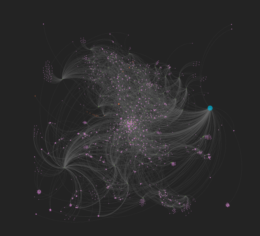
Here’s the solution, as shown for the Dexter Gordon network:


Nice and tidy, with an icon-like image created in Powerpoint; the outer circle around the image is colored to match the artist node at the center of the graph for a consistent visual appearance. Even when the sidebar is shown and the graph is zoomed in, this approach works well:


Note that the musician image is combined with the background color and the circle shape in Powerpoint, and is then saved as a picture we can use in our CSS file for the network. Here’s a look at the styling elements for this graph:
#carte {
position: absolute;
background-image: url('../img/Gordon_20230306.png');
background-repeat: no-repeat;
background-size: cover;
left: 0px;
width: 100%;
height: 100%;
}
We ensure that the background image is set to cover the entire screen by using the background-size attribute and setting it to ‘cover’. This enables the background to adjust to larger screen sizes seamlessly – no awkward edges to be seen!
From my perspective, this approach solves two issues in a very nice way:
- First, it provides a consistent look & feel to the networks, regardless of which artist we select
- Second, it is very production-friendly; I can use the same background and circle while adding in a new artist picture. This provides a very efficient solution for creating future graph networks
I’ll be adding more permanent links to all of these networks, but for now, here are the initial three:
https://jazzgraphs.com/graphs/dexter_gordon
https://jazzgraphs.com/graphs/wayne_shorter
https://jazzgraphs.com/graphs/john_coltrane
Thats’ it for now – have fun with the networks and thanks for reading!