Mapping Venues with Flourish

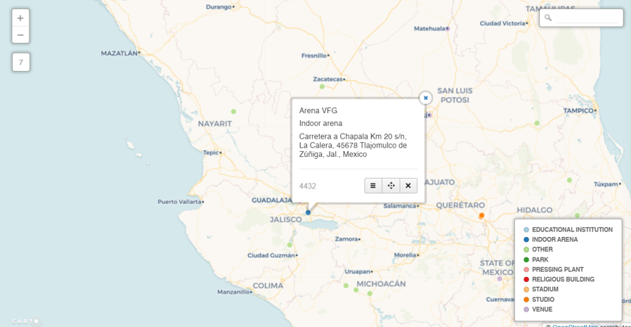
I recently shared some venue maps created in Carto using MusicBrainz data where we can see all the musical venues (with lat/lng coordinates) listed in the database. Now that I am exploring Flourish as a visualization tool, it is time to test the mapping capabilities to see if it provides a viable alternative for geographic visualization.

As with the Carto map, the first step is to retrieve the data with a query from my local MusicBrainz database:

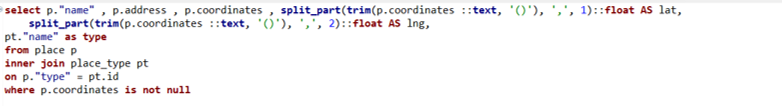
select p.”name” , p.address , p.coordinates , split_part(trim(p.coordinates ::text, ‘()’), ‘,’, 1)::float AS lat,
split_part(trim(p.coordinates ::text, ‘()’), ‘,’, 2)::float AS lng,
pt.”name” as type, ar.name as locale
from place p
inner join place_type pt
on p.”type” = pt.id
inner join area ar
on p.id = ar.id

where p.coordinates is not null

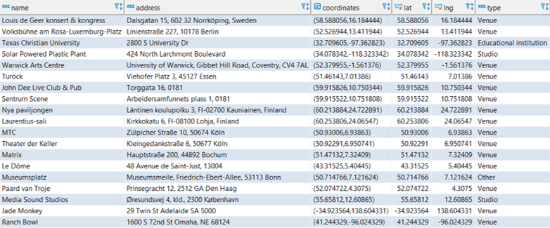
The results are exported to a .csv file for ingestion by the Flourish map template. In this case we are using a point map to display venues using the latitude (lat) and longitude (lng) data we just created. Before uploading our data, we can see that Flourish provides an easy to use template populated with sample data, allowing us to see the data format we need to deliver:

Sample data for a Flourish point map

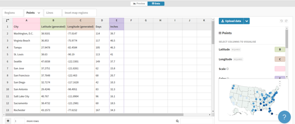
Here we can see a name field (City) and latitude and longitude fields for positioning points on a map. Other attributes provide data that might be used for sizing, coloring, or context.

In our case, we can upload our venues .csv file in this general format, and then tell Flourish which columns to use. Here’s what our data looks like after uploading:

Data for venue mapping

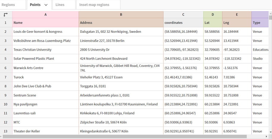
Now that the data has been uploaded we can specify which columns to use. Rather than using column names (Name, Address, etc.), Flourish works off the actual column locations (A, B, C, etc.). These are the values we need to input in the options tab. We can use A, B, and F for describing the data with labels and/or popups, use D for latitude and E for longitude, and switch from the Date to the Preview pane.

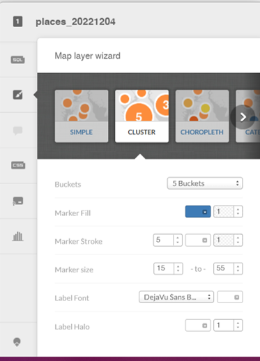
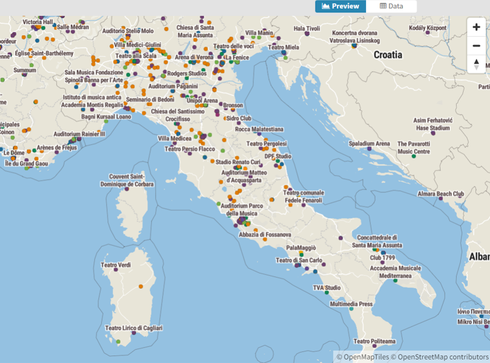
When we complete that task, Flourish gives us an attractive map, with many templates to choose from, and dozens of options for styling the map and surrounding area:

Venues map zoomed in to Italy

Here’s a quick view of the many available categories for styling your map:

Template options for mapping with Flourish

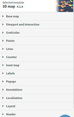
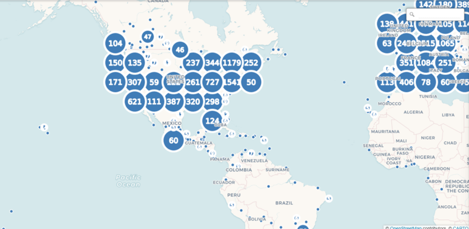
We’ll skip the details for now, but it is obvious that we could do an amazing number of things to customize our map.

To answer my earlier question, it appears that Flourish will be more than capable for mapping a variety of data, and I’m looking forward to testing it with much larger data sets. See you soon, and thanks for reading!

Music Venues – Interactive Maps

As a follow-up to my last post on mapping music venues using the great MusicBrainz database, I am adding interactive versions of the maps for you to explore. First up is the cluster map showing aggregations of venues across the globe. Scroll in and out to view more or less detail:

The second map view uses a categorical approach, coloring each venue by it’s specific type (arena, stadium, etc.) and provides additional information when a venue is selected. As you scroll in the specific venues become more visible:

Have fun exploring, and watch for new maps coming soon!

Music Venues Mapped

The last two weeks have been quite involved with updating my local database with data from the amazing MusicBrainz site. If you’re not familiar with MusicBrainz, it is a bit of a wiki for musical data, including artists, releases, places, and so much more. It’s a truly impressive data source, and it is, of course, very large from a data perspective.

While this site is skewed toward jazz, it would be a shame not to dabble in some other genres; after all, I have spent my share of time listening to classical, rock, Americana, and a few more styles of music. I’ll begin with a simple mapping of all the places (not just jazz venues) in MusicBrainz with lat/lng coordinates, using my old friend Carto to do the display work.

Let’s start by viewing a set of the raw data from the place table using DBeaver:

Data sample of MusicBrainz places

Here you get an idea of useful information we can pull from the place table; name, address, coordinates, and type, plus new fields created in the query for latitude and longitude. Carto (plus Mapbox and other mapping platforms) requires latitude and longitude attributes in order to map the data. Here’s the simple code used to extract this information:

Code to create lat/lng attributes

After creating a .csv export file, the data is uploaded to Carto, where we can begin mapping the information in a variety of ways. Since the places dataset is quite large (21k records with coordinates), a cluster map might prove useful. Carto allows for setting some options, including bubble and text sizes to optimize the display. Cluster maps aggregate the information at high levels, and then allow us to scroll in on the information at a more localized level. Here is the Carto menu:

Setting cluster options in Carto

Here’s a very high level display using the cluster option:

Top level of the place cluster map

As we scroll in, the bubbles will change into smaller aggregations:

Scrolling in on the place cluster map

At the deepest level of scrolling, every place in the data file will display as a single point at it’s respective lat/lng coordinates:

Lowest level of the place cluster map

This is fun to see how the data is aggregated and ultimately dispersed at lower and lower levels, but it comes with some limitations, including the inability to see any identifying details at the individual place level. To see this information, we’ll need a different Carto visualization.

Let’s investigate the category option, which allows for the addition of labels and the coloring of attributes by a specific category. We select the categorywizard, and choose the type column to be used for coloring markers on the map.

Setting Carto category map options

Here’s what we see at a very high level – lots of individual markers (and colors) that are not consolidated as they were with the cluster approach.

High level view of the place category map with type colors

The positive trade-off comes when we select any individual marker, where we have set up the info window to display the name, type, and address:

An individual place with detailed information

This was a simple overview for how we can visualize the place data; in future posts I look forward to exploring some more interesting uses of this rich geographic data. Thanks for reading!

We’re Back!

After a 4-year(!) absence, I’m trying to get back in the groove with the Jazzgraphs site. The first step is to update the data tables behind the scenes, using data from the MusicBrainz project, a sort of Wikipedia for music information. The potential is enormous, but involves some effort on my end to get things rolling again.

MusicBrainz provides an amazing array of data covering artists, recordings, labels, etc. that can be leveraged for some fun visualizations. For now, I’m in the midst of the data wrangling stage, updating each table with the freshest data available so I can stay up to date. BTW, the data extends well beyond jazz, so get ready for some visualizations that extend the boundaries a bit.

The plan is to get the data refreshed over the next week, and then to start building some interesting networks covering pivotal artists; in the past I did some work presenting networks for Charles Mingus, Miles Davis, and the ECM label.

Mingus:

Charles Mingus musical network

Miles:

Miles Davis album and musician network

ECM:

ECM Graph

Stay tuned for some fresh new work in the coming weeks and months!

The Music of Charles Mingus

In honor of the recently released Mingus live recording from 1973, Jazz in Detroit/Strata Concert Gallery/46 Selden, I have created a Mingus network graph detailing his many recordings and songs, using data from the MusicBrainz database. This new recording is not part of the network, but many other classic Mingus works are detailed.

This graph shows Mingus at the center, surrounded by his many recordings, with individual songs connected to the recordings where they appear. Songs are sized based on the number of recordings they appeared on, providing a quick glimpse into Mingus’ most notable tunes. Use the zoom and pan controls as well as the search box to navigate the graph. The data is sourced from the MusicBrainz database, while the graph is built using Gephi and sigma.js.

Here’s a link to the live version – enjoy!

ECM Label Network

One of the great strengths of the MusicBrainz database is that we can build networks using not only artists, but also record labels, or even individual songs. In this post, we’re going to explore an example (per a reader suggestion) using the ECM label and its variants. ECM is known for producing high quality recordings from an array of both jazz and classical artists. Keith Jarrett, Charles Lloyd, and Gary Burton are among some of the better known artists with multiple ECM recordings.

In contrast to our Miles Davis network, where the focus was on the artist, we now wish to see the labels (ECM) as hubs within the network. We’ll take a similar approach to constructing the node and edges files, although we now are going to create a multi-modal structure with 4 layers: Label –> Artist –> Release –> Songs. Using PostgreSQL, we can pull this data quite easily from the MusicBrainz database. Let’s start with the nodes logic:

SELECT a.*
FROM
((SELECT CONCAT(l.name, ‘ (Label)’) AS id, l.name AS name, l.name AS label, ‘Label’ AS type, 30 AS size
FROM label l
WHERE l.id IN(46800,1884,106711,123517))

UNION ALL

(SELECT CONCAT(ac.name, ‘ (Artist)’) AS id, ac.name AS name, ac.name AS label, ‘Artist’ AS type, 10 AS size

FROM public.release r
INNER JOIN public.artist_credit ac
ON r.artist_credit = ac.id
INNER JOIN public.medium m
ON r.id = m.release
INNER JOIN public.medium_format mf
ON m.format = mf.id
INNER JOIN public.release_label rl
ON r.id = rl.release
INNER JOIN public.label l
ON rl.label = l.id

WHERE l.id IN(46800,1884,106711,123517))

UNION ALL

(SELECT CONCAT(r.name, ‘ (Release)’) AS id, r.name AS name, r.name AS label, ‘Release’ AS type, COUNT(DISTINCT rl.release) AS size

FROM public.release r
INNER JOIN public.release_label rl
ON r.id = rl.release
INNER JOIN public.label l
ON rl.label = l.id

WHERE l.id IN(46800,1884,106711,123517)
GROUP BY r.name
)

UNION ALL

(SELECT CONCAT(ta.name, ‘ (Song)’) AS id, ta.name AS name, ta.name AS label, ‘Song’ AS type, COUNT(DISTINCT rl.release)
AS Size
FROM public.release r
INNER JOIN public.artist_credit ac
ON r.artist_credit = ac.id
INNER JOIN public.medium m
ON r.id = m.release
INNER JOIN public.medium_format mf
ON m.format = mf.id
INNER JOIN public.release_label rl
ON r.id = rl.release
INNER JOIN public.label l
ON rl.label = l.id
INNER JOIN public.track t
ON m.id = t.medium
INNER JOIN public.track_aggregate ta
ON t.name = ta.name

WHERE l.id IN(46800,1884,106711,123517)

GROUP BY ta.name
)) a

The four sections of code are united by one common attribute – the four record label identifiers associated with ECM. Section 1 creates nodes for the record labels, section 2 the recording artists, section 3 the releases, and section 4 the songs on each release. This should give us a very interesting network, although it will not have the same level of cross-pollination as the earlier Miles Davis network, as the songs are being associated with specific releases.

Creating the edges is quite similar, albeit requiring just three sections of code:

SELECT a.*
FROM
((SELECT CONCAT(l.name, ‘ (Label)’) AS source, CONCAT(ac.name, ‘ (Artist)’) AS Target, ‘Label’ AS source_type, ‘Artist’ AS target_type
FROM public.label l
INNER JOIN public.release_label rl
ON l.id = rl.label
INNER JOIN public.release r
ON rl.release = r.id
INNER JOIN public.artist_credit ac
ON r.artist_credit = ac.id

WHERE l.id IN(46800,1884,106711,123517))

UNION ALL

(SELECT CONCAT(ac.name, ‘ (Artist)’) AS Source, CONCAT(r.name, ‘ (Release)’) AS Target, ‘Artist’ AS source_type, ‘Release’ AS target_type
FROM public.release r
INNER JOIN public.release_label rl
ON r.id = rl.release
INNER JOIN public.artist_credit ac
ON r.artist_credit = ac.id
INNER JOIN public.label l
ON l.id = rl.label

WHERE l.id IN(46800,1884,106711,123517))

UNION ALL

(SELECT CONCAT(r.name, ‘ (Release)’) AS Source, CONCAT(ta.name, ‘ (Song)’) AS Target, ‘Release’ AS source_type, ‘Song’ AS target_type
FROM public.release r
INNER JOIN public.release_label rl
ON r.id = rl.release
INNER JOIN public.artist_credit ac
ON r.artist_credit = ac.id
INNER JOIN public.label l
ON l.id = rl.label
INNER JOIN public.medium m
ON r.id = m.release
INNER JOIN public.track t
ON m.id = t.medium
INNER JOIN public.track_aggregate ta
ON t.name = ta.name

WHERE l.id IN(46800,1884,106711,123517))
) a
GROUP BY a.source, a.target, a.source_type, a.target_type

Here we are simply connecting labels to artists, artists to releases, and releases to songs. Both the node and edge results are saved to .csv files for use in Gephi.

Once the data was in Gephi, I spent parts of a few days testing layouts, spacing, colors, sizing, and so on, before settling for the moment on using the popular Force Atlas 2 algorithm. I find it useful to start the process using the rapid (and less precise) OpenOrd algorithm whenever working with a fairly complex or large dataset. Then, once the basic network structure is revealed, we can move on to Yifan Hu, Force Atlas, or any of the more precise methods.

For the (for now) final version, I elected to size the nodes based on the number of outbound degrees, which will place more visual emphasis on the record labels and releases, respectively. Artists with multiple releases will also be represented by slightly larger nodes. So here are two versions, the first in Gephi:

The second version is from the web, after tweaking settings in sigma.js:

To interact with the network, click here. Thanks for reading!

Building JazzGraphs, Part 1

As the initial versions of my JazzGraphs networks are being tested, I thought this would be an appropriate time to walk through the process I use for moving the data from raw database form to the eventual network graph output shared on this site. Mind you, I am still iterating through the data, testing what works best for graph creation, and otherwise seeking to create some memorable output that pays homage to many of the great jazz artists of the last 100 years. Ultimately, the process could change a bit, but it feels like things are pretty stable for the moment. So here goes with a basic outline for the steps currently being taken to create the graphs.

Of course it all starts with the data. Without a good data source, these graphs would be tremendously challenging to create. One could do some web scraping, endless Google searches, or even go old school with trips to the local library. None of these approaches are efficient nor would they yield the amount of data I would like to have for this project. Enter MusicBrainz, a quite remarkable site devoted to building the most comprehensive source of all things musical. Their stated mission is to be:

    1. The ultimate source of music information by allowing anyone to contribute and releasing the data under open licenses.
    2. The universal lingua franca for music by providing a reliable and unambiguous form of music identification, enabling both people and machines to have meaningful conversations about music.

While the content in any such site is never perfect (think Wikipedia), it nonetheless provides a fantastic starting point for projects such as JazzGraphs.

Fortunately for me (and other SQL coders), the MusicBrainz database is available in a PostgreSQL format, which is very similar to the MySQL databases more familiar to me. So the learning curve has been anything but steep in technical terms. The greater challenge has come in the sheer number of tables and fields in the database, and figuring out which ones are highly populated versus the ones intended for future growth. Another interesting aspect is the multiple spelling variations available for a single song or even an album release. Such are the challenges with public contributions; fortunately they are more than offset by the impressive level of detail available for many artists.

To add some visual perspective, here’s a view of the MusicBrainz schema I am tapping into for the JazzGraphs data:

So now you have a basic idea for what the database looks like, how joins are implemented, and how the general naming conventions work. Much of the artist information is found in the upper left of the diagram, with release details in the lower left. Works (songs) can be seen in the lower right quadrant, while the upper right is largely concerned with location and label information. Note that this is but a small subset of the more than 300 tables in the database.

Once the data is available, the challenge is to understand all the relationships within the data, as well as where to find the most robust tables and fields. As I noted earlier, not all tables are populated equally at this point, so it is critical to work within the framework of what’s currently in the database. Fortunately, for a prominent artist such as Miles Davis, we find plenty of data in some of the key tables. This enabled me to begin testing SQL code, and to also envision how I might wish to display the data in a network graph. After a few rounds of testing, I arrived at the conclusion that using a tri-modal approach might be the best approach. In other words, the artist (Miles Davis, in this case) connects directly to specific releases (an album or CD), which in turn connect directly to the songs on the release. What makes this approach appealing is the fact that many songs show up on multiple releases; otherwise, we would wind up with a simple hierarchical (think organization chart) output, and that wouldn’t be much fun 🙂 .

The next step is to create output for use in Gephi. Recall that in most cases, network graphs require both node and edge inputs. What do these represent in our current case? Since nodes are the graphical representation of specific objects or entities, we have three types in this analysis:

    1. The artist (Miles Davis)
    2. All releases (Kind of Blue, Bitches Brew, etc.)
    3. All songs (So What, Milestones, etc.)

Each of these elements should have a single node; we can later adjust for frequency by sizing the nodes in our graph. For example, if ‘So What’ shows up on 20 releases, we want to display a single node that connects to each of those releases, and then size the node based on frequency. More on that in a bit. So our initial code will focus on creating these nodes, as shown below, using a UNION query to place all of our nodes in a single result, which can then be exported to a .csv file for Gephi to ingest. Here’s the code:

SELECT a.*
FROM
((SELECT CONCAT(ac.name, ‘ (Artist)’) AS id, ac.name AS name, ac.name AS label, ‘Artist’ AS type, 50 AS size

FROM public.artist_credit ac

WHERE ac.id = 1954)

UNION ALL

(SELECT CONCAT(r.name, ‘ (Release)’) AS id, r.name AS name, r.name AS label, ‘Release’ AS type, COUNT(DISTINCT rl.release) AS size

FROM public.release r
INNER JOIN public.artist_credit ac
ON r.artist_credit = ac.id
INNER JOIN public.medium m
ON r.id = m.release
INNER JOIN public.medium_format mf
ON m.format = mf.id
INNER JOIN public.release_label rl
ON r.id = rl.release
INNER JOIN public.label l
ON rl.label = l.id

WHERE r.artist_credit = 1954
GROUP BY r.name
)

UNION ALL

(SELECT CONCAT(ta.name, ‘ (Song)’) AS id, ta.name AS name, ta.name AS label, ‘Song’ AS type, COUNT(DISTINCT rl.release)
AS Size
FROM public.release r
INNER JOIN public.artist_credit ac
ON r.artist_credit = ac.id
INNER JOIN public.medium m
ON r.id = m.release
INNER JOIN public.medium_format mf
ON m.format = mf.id
INNER JOIN public.release_label rl
ON r.id = rl.release
INNER JOIN public.label l
ON rl.label = l.id
INNER JOIN public.track t
ON m.id = t.medium
INNER JOIN public.track_aggregate ta
ON t.name = ta.name

WHERE r.artist_credit = 1954
GROUP BY ta.name
)) a

As you may have gathered, the ‘1954’ value for the artist_credit corresponds with Miles Davis’ unique id in the database. The beauty of this code is that we need only modify that id in each of the 3 code sections to pull the same type of detail for another artist. So our code is highly reusable. Once our results have been returned, we simply export the results to a .csv format.

Now that the node code has been completed, it’s time to focus on the creation of edges, the connections between nodes. In this case, we want releases to connect only to the artist, and songs to connect only to releases. Once again we’ll use SQL UNION logic to merge results from each section into a single set of results for use in Gephi. Here’s a look at the code for edge creation:

SELECT a.*
FROM
((SELECT CONCAT(ac.name, ‘ (Artist)’) AS source, CONCAT(r.name, ‘ (Release)’) AS Target, ‘Artist’ AS source_type, ‘Release’ AS target_type
FROM public.artist_credit ac
INNER JOIN public.release r
ON ac.id = r.artist_credit
INNER JOIN public.release_label rl
ON r.id = rl.release
WHERE ac.id = 1954)

UNION ALL

(SELECT CONCAT(r.name, ‘ (Release)’) AS Source, CONCAT(ta.name, ‘ (Song)’) AS Target, ‘Release’ AS source_type, ‘Song’ AS target_type
FROM public.release r
INNER JOIN public.release_label rl
ON r.id = rl.release
INNER JOIN public.medium m
ON r.id = m.release
INNER JOIN public.track t
ON m.id = t.medium
INNER JOIN public.track_aggregate ta
ON t.name = ta.name

WHERE r.artist_credit = 1954)) a
GROUP BY a.source, a.target, a.source_type, a.target_type

Pretty simple – in the first section, the artist represents the source node, and all releases become the target nodes (source and target values are essential to Gephi edge creation). The second section adds releases as the source nodes, and songs as target nodes. This will give us the tri-modal network structure I spoke of earlier.

Next comes the fun part (not to say that coding can’t be fun 🙂 ) where we start to use Gephi to create our network. The next post will examine how we pull the data into Gephi and start creating our network. Hope you found this informative and helpful, and thanks for reading!

Visualizing Miles, Part 2

One of my favorite aspects of working with web projects is the ability to use CSS to customize a page. This is especially the case when working with sigma.js for the deployment of network graphs. CSS makes it easy to quickly test and change colors, modify elements, and experiment with different fonts. This is all important when I’m seeking a particular look and feel for a visualization. Which leads into this updated take on my recently created Miles Davis network graph, wherein the node colors, edge widths, and font sizes have all been modified, for the better, I believe.

In place of the nearly black background is a deep, rich blue, as well as new node colors and a more readable font color for the sidebar. Here are the before and after views:


And the updated look:


Visualizing Miles

I’ve been spending some time working with data from the MusicBrainz site, and exploring various ways to create networks using Gephi. My initial explorations focus on the vast musical network of Miles Davis, as seen through album releases and the many songs Miles recorded. Here’s a look at one such iteration, wherein Miles is connected to releases, which are in turn connected to songs. Of course, many of the songs are associated with multiple releases, making for an interesting graph displaying all the connections between artist, releases, and songs.

Miles can be found to the far right of this graph, with dozens of connections flowing outbound to his many releases. In the web-based version below (built using sigma.js), we can see a bit more detail and structure in the network:

Now Miles can be seen clearly, as we have enlarged his node to draw attention to him as the focal point of the network. We can also begin to see some of the most frequently released songs as larger pink circles. Tunes like ‘So What’ and ‘Milestones’ appear on many releases, and are sized accordingly. Of course, one of the best aspects of deploying the network to the web is the ability to offer interactivity, where users can zoom, pan, click, and otherwise navigate the network to learn more. If you wish to do so, click here to open the network in a new tab.

Note that this is an unfinished product at this point, despite being several iterations in the making. I have yet to resolve spelling differences that make one song appear to be many different tunes (‘Round Midnight is a classic example), and I also plan to make some other modifications. Having said that, it feels like we’re close to a working template that will allow for depicting the networks of so many of the heroes of jazz – Coltrane, Monk, Ellington, Parker, Mingus, and many more.

So stay tuned for periodic updates and improvements, and thanks for reading!

Welcome to JazzGraphs!

Welcome to the JazzGraphs website! This site will feature a variety of visualizations documenting the fascinating history of jazz music – the artists, labels, and recordings that make up this great American art form.

My goal is to apply my data visualization skills to create memorable images that capture the amazing history of jazz music in ways that are creative, innovative, and visually gorgeous. Here’s one example to provide an idea where this site is headed:

This is a snapshot of a network graph detailing the studio albums of jazz legend Miles Davis, along with all of the sidemen playing on each recording. Many of the visualizations will take this general form, but other data visualization approaches will also be utilized. Lots of the graphs will be interactive, allowing you to have a fun exploring the myriad relationships surrounding an artist, label, or recording.

The eventual goal will be to turn some of these graphs into printed posters and a book sometime in 2018. More details on timing to follow in future posts.