Tag: Carto

Music Venues – Interactive Maps

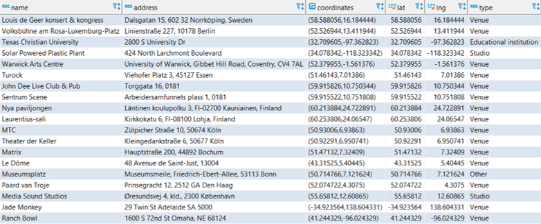
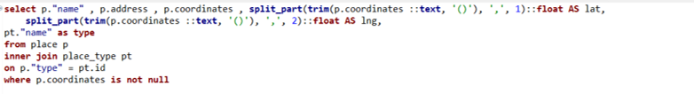
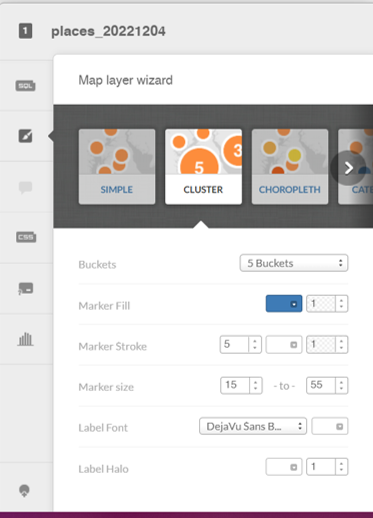
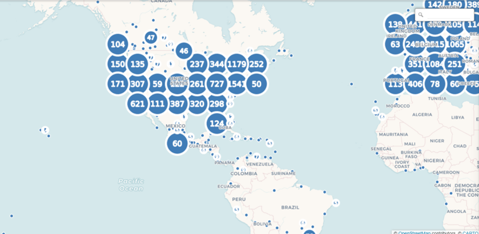
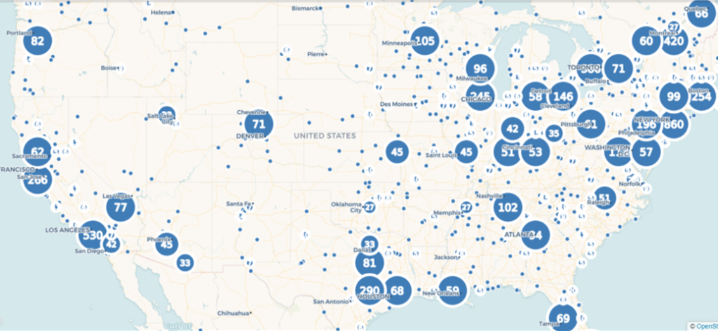
As a follow-up to my last post on mapping music venues using the great MusicBrainz database, I am adding interactive versions of the maps for you to explore. First up is the cluster map showing aggregations of venues across the globe. Scroll in and out to view more or less detail:

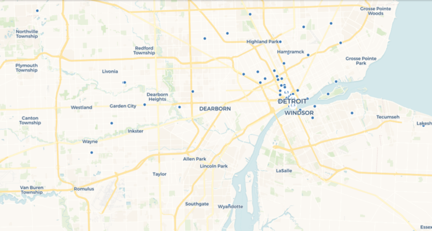
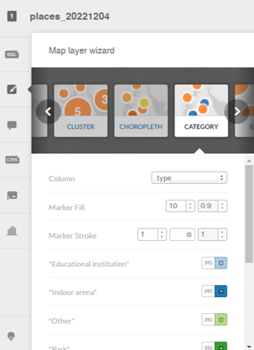
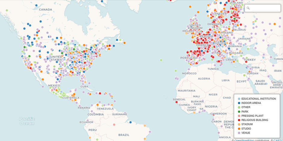
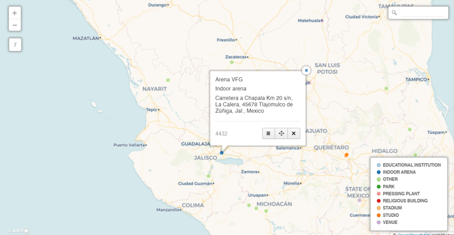
The second map view uses a categorical approach, coloring each venue by it’s specific type (arena, stadium, etc.) and provides additional information when a venue is selected. As you scroll in the specific venues become more visible:

Have fun exploring, and watch for new maps coming soon!

Music Venues Mapped

The last two weeks have been quite involved with updating my local database with data from the amazing MusicBrainz site. If you’re not familiar with MusicBrainz, it is a bit of a wiki for musical data, including artists, releases, places, and so much more. It’s a truly impressive data source, and it is, of course, very large from a data perspective.

While this site is skewed toward jazz, it would be a shame not to dabble in some other genres; after all, I have spent my share of time listening to classical, rock, Americana, and a few more styles of music. I’ll begin with a simple mapping of all the places (not just jazz venues) in MusicBrainz with lat/lng coordinates, using my old friend Carto to do the display work.

Let’s start by viewing a set of the raw data from the place table using DBeaver:

Data sample of MusicBrainz places

Here you get an idea of useful information we can pull from the place table; name, address, coordinates, and type, plus new fields created in the query for latitude and longitude. Carto (plus Mapbox and other mapping platforms) requires latitude and longitude attributes in order to map the data. Here’s the simple code used to extract this information:

Code to create lat/lng attributes

After creating a .csv export file, the data is uploaded to Carto, where we can begin mapping the information in a variety of ways. Since the places dataset is quite large (21k records with coordinates), a cluster map might prove useful. Carto allows for setting some options, including bubble and text sizes to optimize the display. Cluster maps aggregate the information at high levels, and then allow us to scroll in on the information at a more localized level. Here is the Carto menu:

Setting cluster options in Carto

Here’s a very high level display using the cluster option:

Top level of the place cluster map

As we scroll in, the bubbles will change into smaller aggregations:

Scrolling in on the place cluster map

At the deepest level of scrolling, every place in the data file will display as a single point at it’s respective lat/lng coordinates:

Lowest level of the place cluster map

This is fun to see how the data is aggregated and ultimately dispersed at lower and lower levels, but it comes with some limitations, including the inability to see any identifying details at the individual place level. To see this information, we’ll need a different Carto visualization.

Let’s investigate the category option, which allows for the addition of labels and the coloring of attributes by a specific category. We select the categorywizard, and choose the type column to be used for coloring markers on the map.

Setting Carto category map options

Here’s what we see at a very high level – lots of individual markers (and colors) that are not consolidated as they were with the cluster approach.

High level view of the place category map with type colors

The positive trade-off comes when we select any individual marker, where we have set up the info window to display the name, type, and address:

An individual place with detailed information

This was a simple overview for how we can visualize the place data; in future posts I look forward to exploring some more interesting uses of this rich geographic data. Thanks for reading!