I’ve been spending some time working with data from the MusicBrainz site, and exploring various ways to create networks using Gephi. My initial explorations focus on the vast musical network of Miles Davis, as seen through album releases and the many songs Miles recorded. Here’s a look at one such iteration, wherein Miles is connected to releases, which are in turn connected to songs. Of course, many of the songs are associated with multiple releases, making for an interesting graph displaying all the connections between artist, releases, and songs.
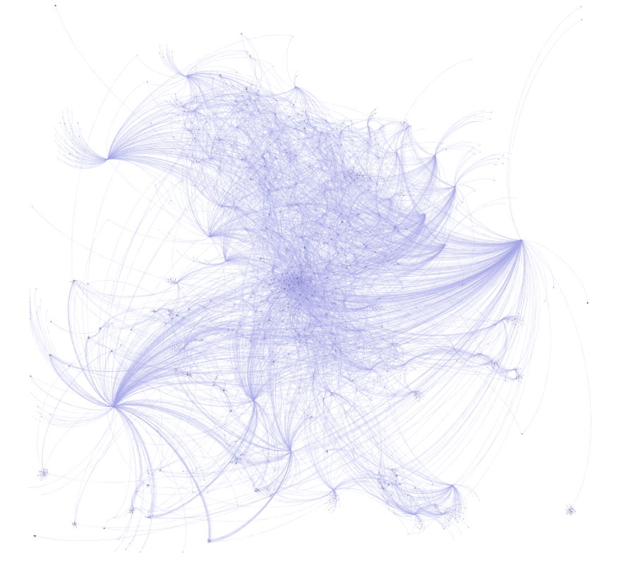
Miles can be found to the far right of this graph, with dozens of connections flowing outbound to his many releases. In the web-based version below (built using sigma.js), we can see a bit more detail and structure in the network:
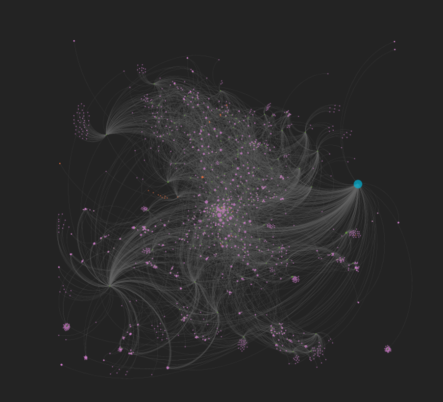
Now Miles can be seen clearly, as we have enlarged his node to draw attention to him as the focal point of the network. We can also begin to see some of the most frequently released songs as larger pink circles. Tunes like ‘So What’ and ‘Milestones’ appear on many releases, and are sized accordingly. Of course, one of the best aspects of deploying the network to the web is the ability to offer interactivity, where users can zoom, pan, click, and otherwise navigate the network to learn more. If you wish to do so, click here to open the network in a new tab.
Note that this is an unfinished product at this point, despite being several iterations in the making. I have yet to resolve spelling differences that make one song appear to be many different tunes (‘Round Midnight is a classic example), and I also plan to make some other modifications. Having said that, it feels like we’re close to a working template that will allow for depicting the networks of so many of the heroes of jazz – Coltrane, Monk, Ellington, Parker, Mingus, and many more.
So stay tuned for periodic updates and improvements, and thanks for reading!
